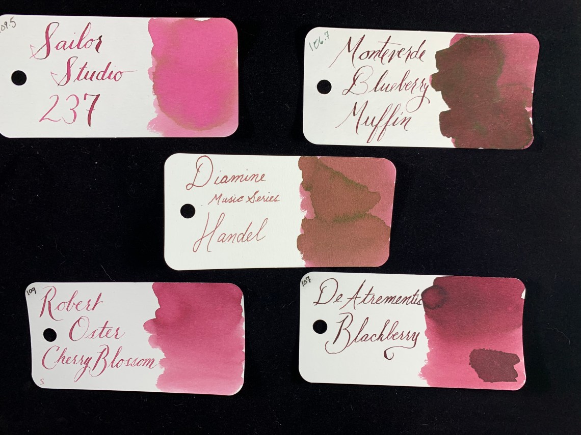
This week I decided to take a break from my normal lines of Sailor Studio and Montblanc inks and instead show an ink that is beautiful, inexpensive, but hard to find.
Diamine makes an astoundingly large variety of inks for a wide variety of clients. Some people even joke that Dimaine makes all inks (it isn’t true!). Two of the more interesting presentations of Diamine ink are their Music set and their Flower set. I have admired many of the colors in both sets for a while; the inks in each set are beautiful and well-matched to one another.

The existence of two sets actually became a problem for me, however. I could never decide which set I preferred. But then, I discovered that I didn’t need to purchase an entire set. I could order individual bottles from Cult Pens!

Although ordering from Cult Pens means ordering from overseas, the shipping rates are quite reasonable Music set along with Gerba, Pansy, and Marigold from the Flowers set.
Handel is a lovely pink-purple-brown ink. When it is first laid down, the ink looks rather muddy and pure brown. But as it starts to separate and dry, the purple and pink undertones start to show and then become the dominant colors. Handel is similar to Monteverde Blueberry Muffin but a dusty version of the reddish ink.


I used a glass dip pen for the writing above, so the shading is not as evident, but in the writing below, I used a fine nib that had no problem showing the shading qualities of Handel. It was rather mesmerizing to watch tthe ink turn from muddy brown to a dusty rose as I was writing.

Here’s a close-up of the shading in Handel (even bettter since the word IS Handel so the shading is actually IN Handel! Sorry).

In larger swatches, I found that the brown is more present that it is in writing. A very faint green-black sheen showed up at the edges of a large pool of the ink, but I never saw it in my writing.

I love that the colors are each very muted but easy to see in my writing – it is one ink that makes me want to keep writing longer just to get more of the color down on the page.
I hope you have enjoyed exploring an often overlooked ink with me! If you have any future suggestions, please let me know!
Tools:
- Paper: Musubi Tomoe River Refill ($30-35 USD)
- Ink: Diamine Handel (Cult Pens, approximately $4.50 for 30mL)
- Swatch Cards: Col-o-ring ink testing cards ($10 for 100 card pack)
DISCLAIMER: All materials used in this review were purchased by me. Please see the About page for more details.

