

Originally, my plan was too include THREE different Leuchtturm 1917 notebooks in one post but it was going to be way too much for one post. So, this will be part two of three. Part 1 is available here.

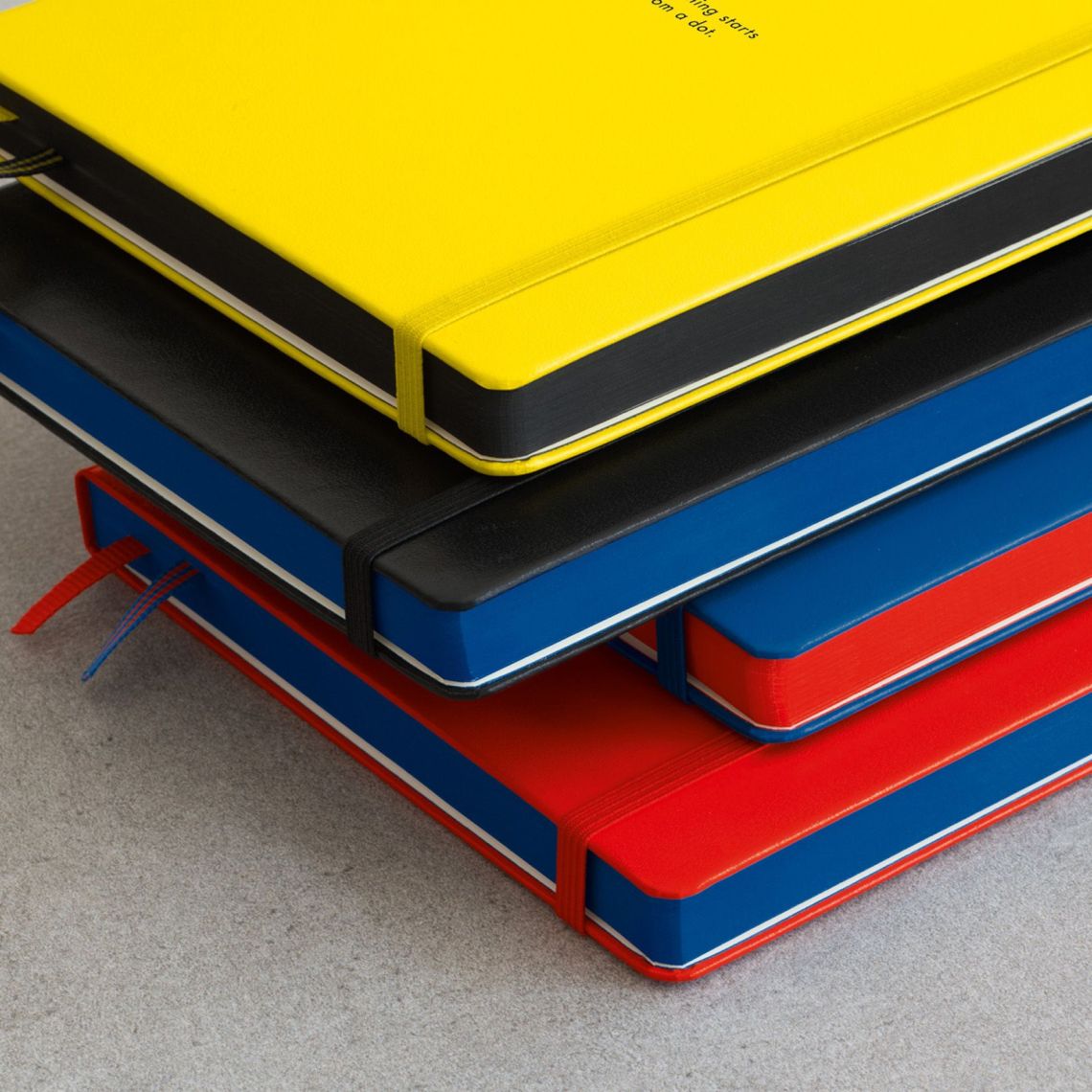
The Leuchtturm 1917 100 Years Bauhaus Edition (A5-sized, $25.95) is available in the appropriately primary colors of Red, Yellow, and Blue as well as Black. Each edition features different colored edge painting and printed dots inside.
The cover features a quote from Vasily Kandinsky, former deputy director of the Bauhaus, “Everything begins with a dot” which I find inspiring.
I purchased the Black edition which featured blue edge painting and blue printed dots on the pages. It is a little unclear if the Yellow cover with black edge painting has yellow dots or black dots, either might be challenging to use. Leuchtturm 1917 had previously released a Red Dots Edition so the Blue cover with red dots is an option available elsewhere in their product line. If anyone has purchased the Yellow cover, let me know in the comments if the interior is black or yellow dots.


The photo above, showing the blue edge painting on the pages and the two ribbon bookmarks also most accurately show the color of the standard Leuchtturm 1917 paper. I don’t understand how or why, even in my studio, the subtly of color of the Leuchtturm 1917 ivory paper is so hard to capture accurately. The photos that follow are considerably too yellow to be considered color accurate but the photos do show the behavior of the inks on the paper which I deemed as important as capturing the paper color.

The Bauhaus Edition notebooks have all the same features as the traditional Leuchtturm 1917 notebooks: two ribbon bookmarks, gusseted pocket and perforated pages in the back, elastic closure, archiving stickers and promotional pamphlets inside. The sewn binding can easily be opened to lay flat and the numbered pages and index in the front of the notebook make it easy to use for bullet journaling or just general organization.

The paper quality is good. It’s a bit toothy and a warm ivory color. Unlike the Whitelines Link notebook, I had minimal issues with showthrough or bleedthrough with average use. The color fidelity is more consistent with the results I’ve had on other non-Tomoe paper. Shading in the fountain pen inks is visible.

There was no real issue with other water-based pens or pencils on the standard Leuchtturm 1917 paper. My only issue was with the blue dots. They are a bit darker than I would have expected them to be especially when compared with the light grey dots on regular Leuchtturm 1917 notebooks. If you regularly use Rhodia dot paper or ruled, it might not be bothersome to you as they seem to be similar in brightness but if you prefer your dot grid to be light and nearly un-noticable, then the blue dots might be as distracting to you as they were to me.
Overall, I still feel that the Leuchtturm 1917 notebooks (be they standard or special editions like the Bauhaus edition) are good products. They are a step up from Moleskine in terms of ink handling and they are well constructed. They feel durable and provide a good middle ground between the wafer-thin Tomoe notebooks (often with astronomical numbers of pages) and thick, chunky 120gsm or thicker notebooks — both of which can feel like a considerable commitment to your notebook life. If you are looking for a “gateway drug” notebook for a new pen fan or you want a quality notebook for everyday notes, Leuchtturm 1917 really is the best standard to choose. Now, if they would just offer more B6-sized notebooks, I would be a very happy pen nerd.
DISCLAIMER: Some items included in this review were purchased with funds from our amazing Patrons. You can help support this blog by joining our Patreon. Please see the About page for more details.


I contacted Leuchtturm and they said the dots on the yellow Bauhaus are black.
Thanks, Steve for checking on that. But black dots? Lame.
I have the yellow Bauhaus notebook and the dots are indeed black. I don’t find that they are that much darker than the regular grey Leuchtturm dot grid. So it is not terrible to use.
Thanks, Greg. Maybe they are less distracting than these blue dots? I might have to try it out myself.
I use the yellow Bauhaus (which I love! so cheerful!). The dots are black or dark grey, and seem just slightly darker than the dots in my standard black Leuchtturm. I don’t find them distracting.
Thanks. I am glad they are not too dark. I might consider ordering one before they disappear.