Guest post by Julia van der Wyk
Colorverse “Golden Gate Bridge” is the “Show ink” for SF pen show 2023. I was excited to see how Colorverse would interpret such an iconic color, which can be hard to pin down. Is it orange? Red? Red-orange?
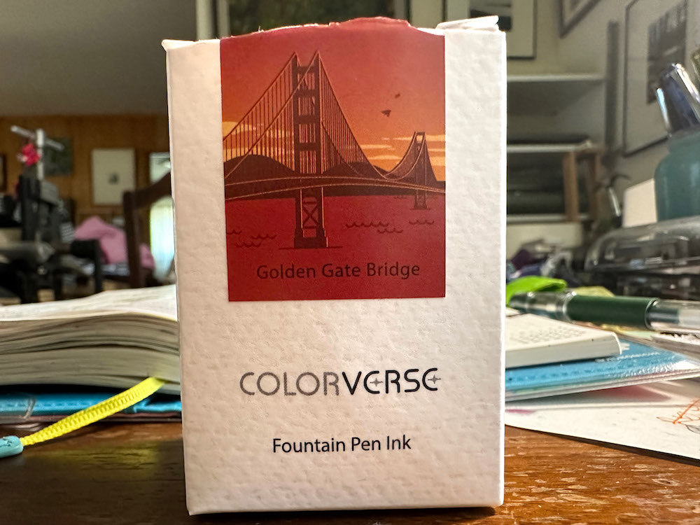
As a Bay Area native, I learned early that the paint color is called “International Orange” (only do an image search on that if you are wearing sunglasses), but as it appears on the bridge itself, it is a deep and rich vermillion. This color is not-red, not-orange, not-pink, an elusive beauty much like the deeper shades of coral.
In this review, I compare the ink with others in my collection, write on a few different papers with a fountain pen, and paint with the ink using a brush in my Art Test.
What is the color like?
The ink is a saturated, non-shading color. I found it to really resemble the bridge color when the ink is wet, but dry to a more magenta-leaning shade.
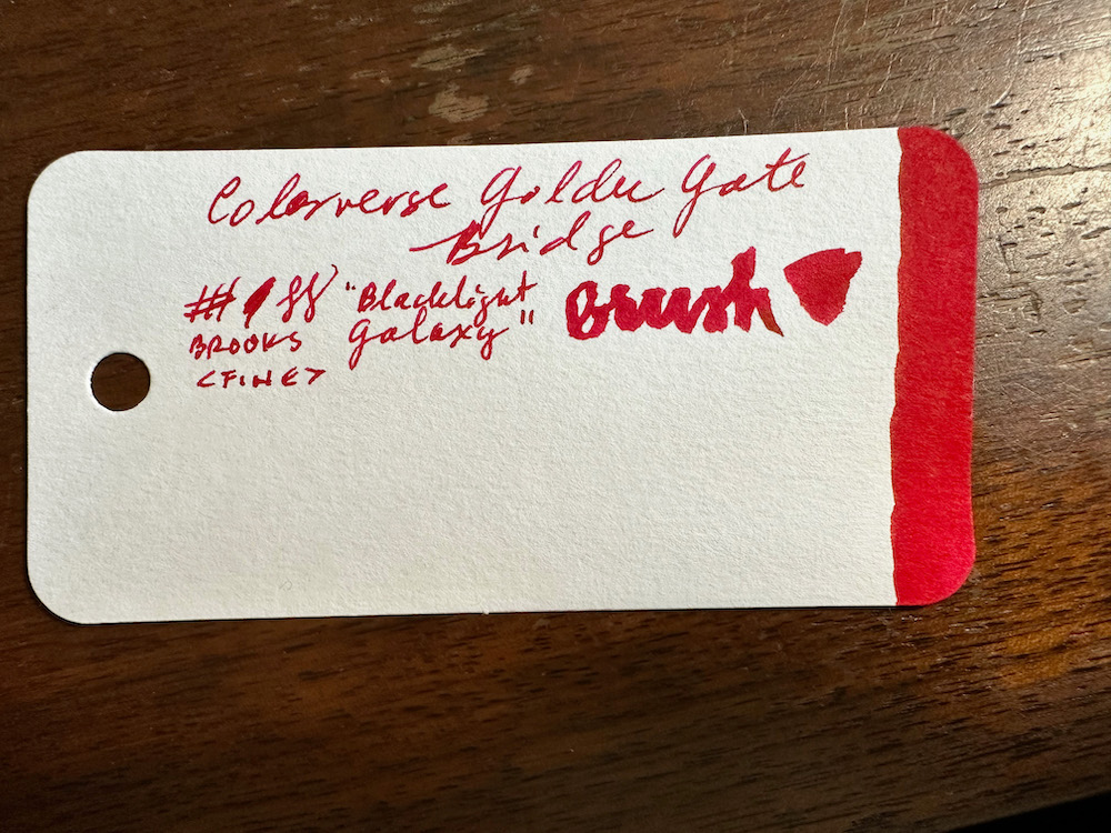
Some Col-o-ring comparisons
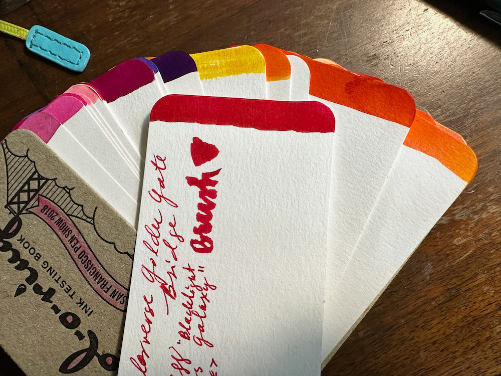
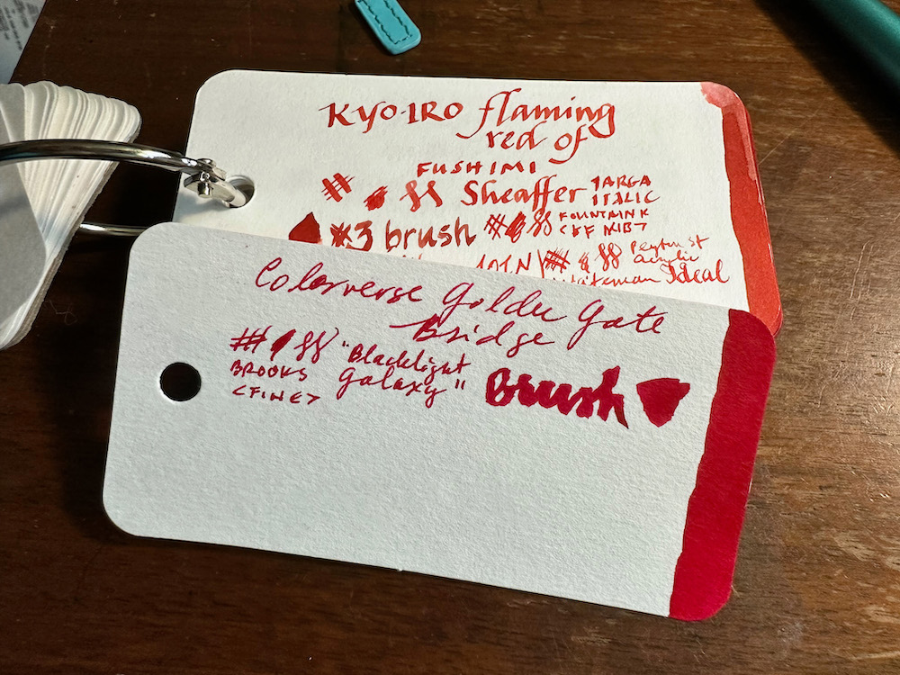
The closest “red” shade I have is Kyo-pro “Flaming red of Fushimi”. This comparison shows how much more saturated, GGB is, and how it has leans away from the yellow-orange tones.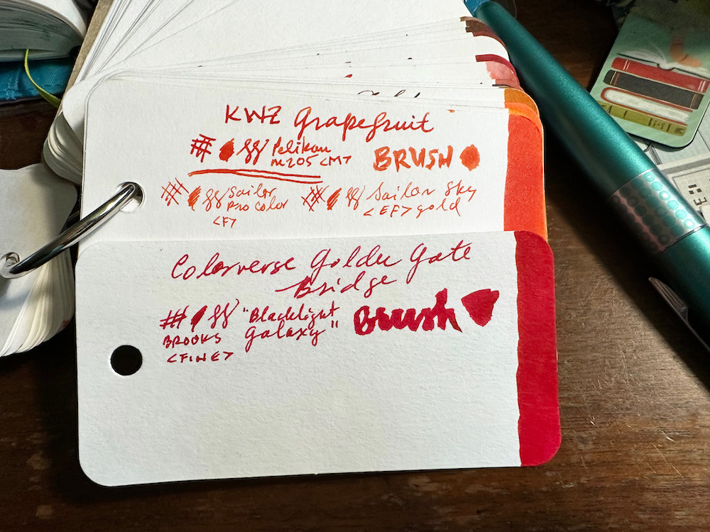
I thought KWZ Grapefruit would be a good match. In this comparison, more shading is evident in Grapefruit, as well as the yellow-orange tones.
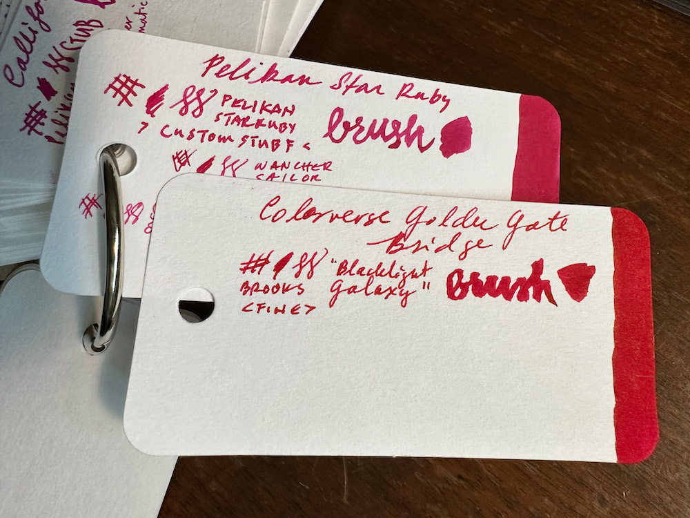
Possibly the closest match from the inks in my collection is Pelikan Edelstein “Star Ruby”. This ink to my eye is straight-up magenta. GGB next to it appears just a bit more a true red, but matches the saturation level really well.
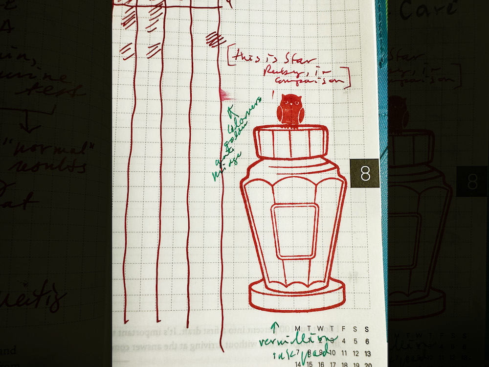
To further illustrate this point, I have an entry from my Hobonichi Techo, which shows lines in a Fine nib of GGB to the left, a short sentence written with Star Ruby in a Fine nib to the right of that. For extra credit, the rubber stamps were inked with the Ranger Archival Ink stamp pad in the color Vermillion! In a Fine fountain pen nib, there is very little difference in perceived shade of the two inks.
Note: The owl rubber stamp is part of a collection I bought from the Hobonichi store, and the lovely ink bottle stamp is of course from the Well-Appointed Desk! One of my favorites in there. But I digress.
Standard Paper tests
So far we have seen the ink with Col-o-ring paper, and Tomoe River paper. What if all we have are a standard Field Notes book, or some copy paper?
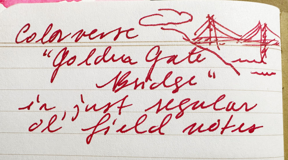
In the Field Notes, I detect a little bit of feathering, if I look closely. Slight show-through on the back, but usable on both sides for sure.
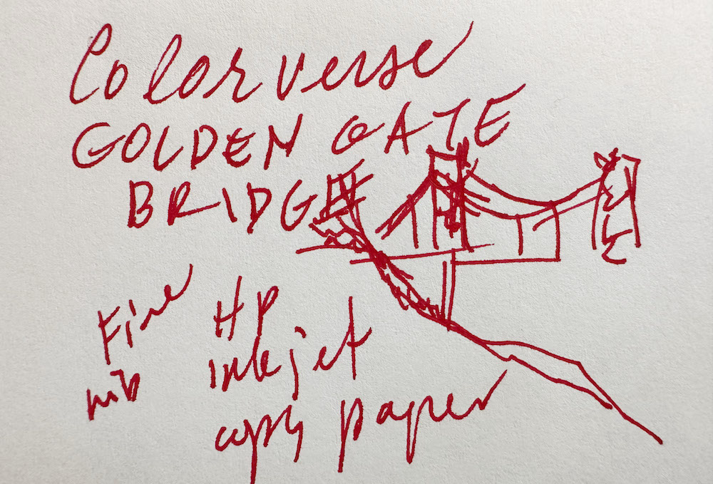
As for the copy paper, I have HP 24lb bright white inkjet paper for my own printer. I found the ink to behave pretty nicely on this paper, with a little bit of feathering visible and minimal show-through.
The Art Test ™
If we have met before, you knew this was coming! The best way I know to discover the true range of an ink, is to paint with it. I use the ink direct from the bottle, as well as dilutions with water. The paper is cold-press watercolor paper. For this piece, I started out with pencil, then used various dilutions of ink and water for the light wash effect. I built depth and shading with straight ink, and when dry, drew fine details with the ink in my fountain pen.
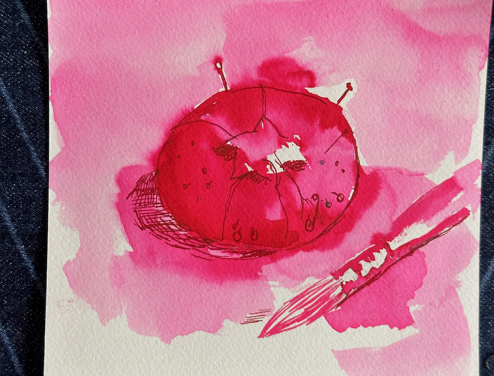
From the lightest light that I could get with dilutions of water, to the darkest dark with fully saturated ink, there are not too many middle shades in this one. This tracks for me in how saturated a color it is in the pen. I also see clearly in the painting, how magenta the lighter shades are. The darkest areas looked more vermillion and had more orange tones when wet. With the detail lines in place, I can see there is a bit of sheen on this paper, which shows more of the warmer hues. I have posted a VoiceOver narration video of my process YouTube while painting this piece over on YouTube, for those curious to see the painting unfold in real time.
TL;DR
Colorverse Golden Gate Bridge is a bright, saturated color. It writes well on a variety of papers. The wet shade is an orangey vermillion, which dries to a magenta-leaning red color. There is no shading, but a bit of sheen can be detected with more intense applications.
 Julia van der Wyk is an artist, classical musician, knitter, and professional web developer (The Web Atrium). She teaches an Ink Painting class at the SF Pen Show, and resides in Santa Cruz, California, where she can draw Pelicans with Pelikans, and brag about the weather. Follow her adventures on Instagram @juliavdw and Juliavanderwyk.com. Also check out her Ink Wash Painting Class!
