Kyoto TAG has released two new inks in their Kyo-no-oto line: Seiheki and Yurushiiro. As with all inks in this line, the ink comes packaged in heavy card stock with the ink line in letterpress print. A big thank you to Dromgoole’s for sending these bottles for review!
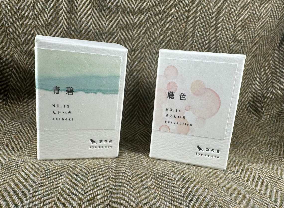
Both Seiheki and Yurushiiro come in 40mL glass bottles priced at $28 a bottle bringing the ink to $0.70 per mL – not an inexpensive ink, but far from the $1 per mL of some recent Sailor inks!
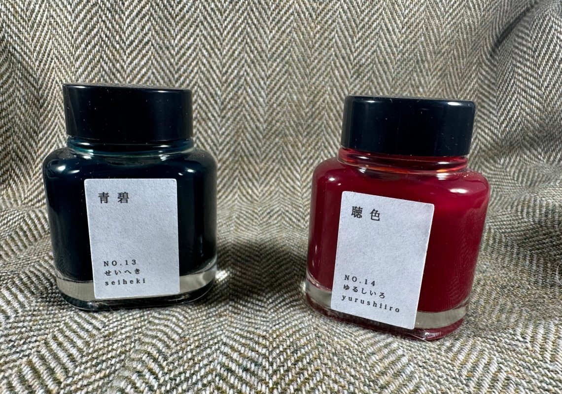
As soon as I opened the package, I noticed that the ink looked almost cloudy. Not opaque like pigmented ink, but not as clear as I would expect.
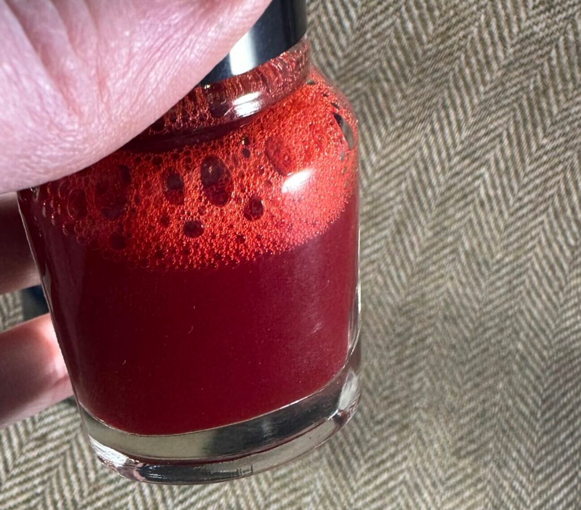
You can see a bit of particulate in the ink – it isn’t sparkling though.

Swatching the inks, it became obvious that the consistency is unusual – there is definitely an opaqueness present. This didn’t translate into an actual thickness of the ink while writing, however.
The first ink I’ll look at here is Kyo-no-oto Seiheki. From the Dromgoole’s site:
“SEIHEKI is a dull blue-green color that would look similar to the daytime sky. ‘Sei’ means blue and ‘heki’ means green-blue stone which originates from ancient times
The color of nature, especially the sky, would stay in the briefest instant. The shorter the time remain, the memory of the color may even be more beautifully remembered. Especially in the middst of the change of the seasons, the color will change every moment. ‘Shogyo-mujo’ is the Japanese word to describe the transience of all phenomena. Many things are impermanent and change with short lives. Those new colors are our message to describe such momentary colors with lyrical images based on traditional Kyoto colors.
*This is a new type of ink combining fine pigments and dyes. The hue changes at the beginning and end of writing.
To realize the special effect, this ink contains small particles of pigment. Please wash the ink feeder and pens completely before you will use other ink with the same pen.”
Seiheki and Yurushiiro are pigment inks, but only a small amount of pigment. While I have inked up pens with each of the inks here today, I have not yet had enough time to report on the writing experience.
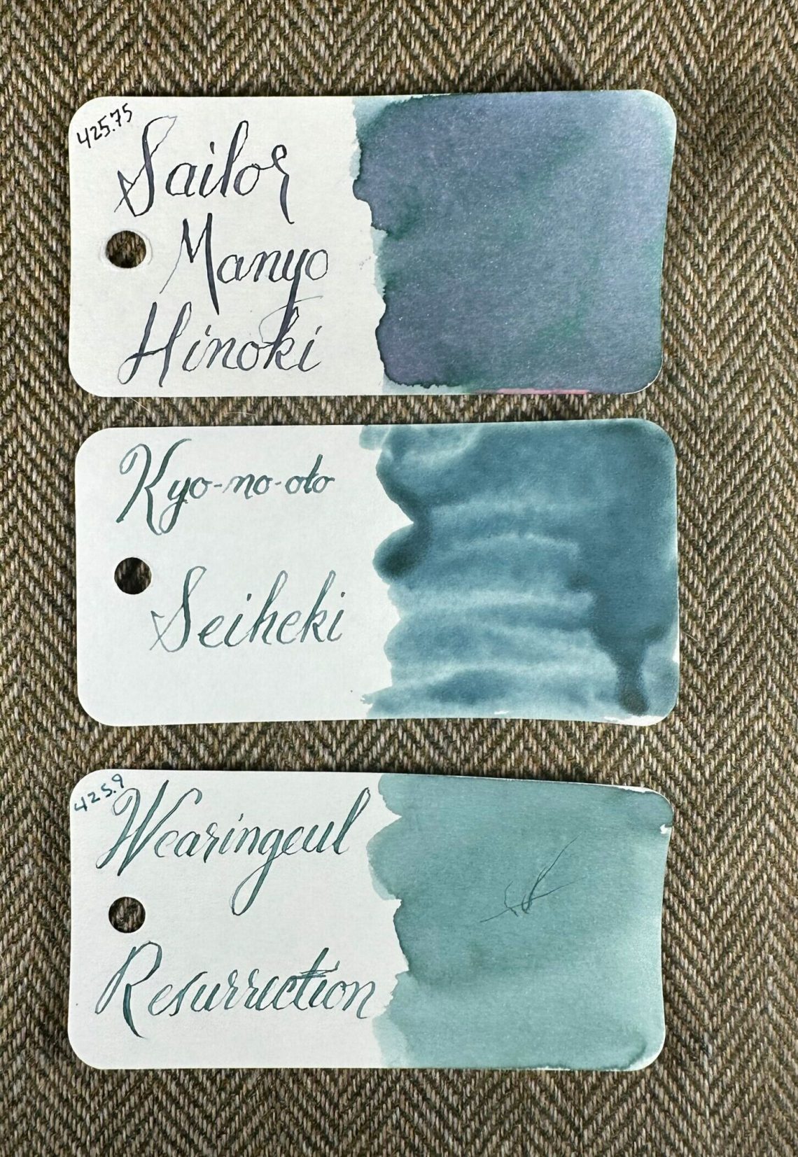
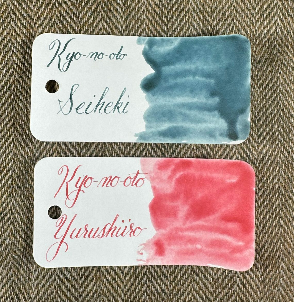
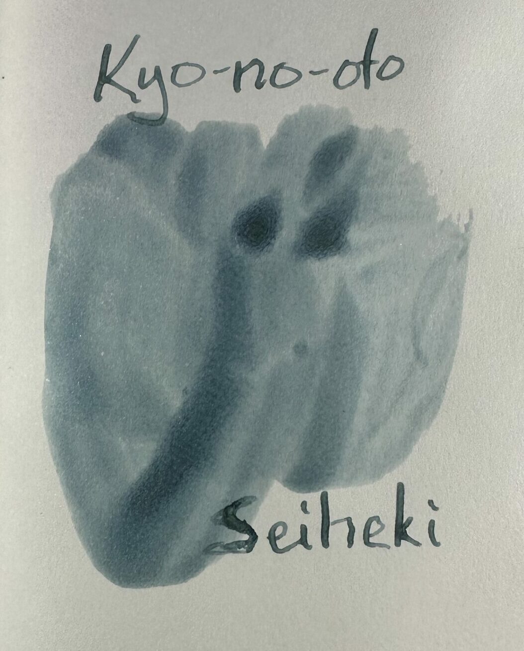
Seiheki is a lovely blue-green close to Wearingeul Resurrection with a touch more blue.
On Midori MD paper:
On Cosmo Air Light 83gsm paper:
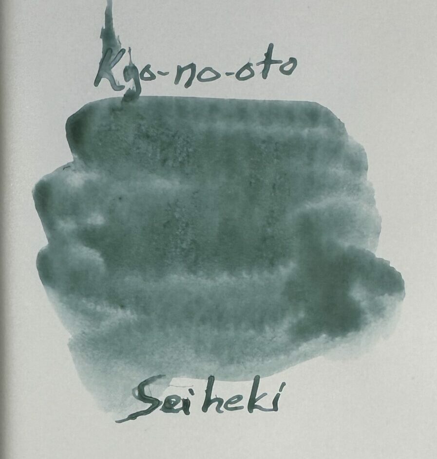
On the same CAL paper as above, but angled to show a bit of the texture on paper:
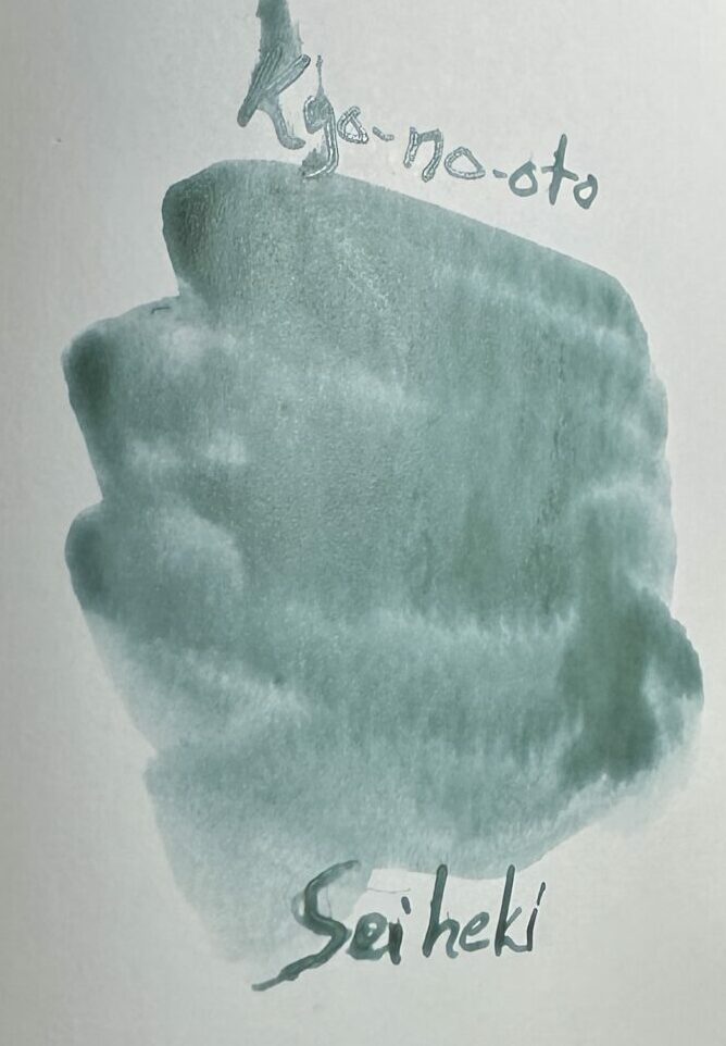
And finally on Tomoe River (TR7) 52gsm paper:

Tomoe River paper seems to bring out an almost pebbled texture in the swatch of ink.
The second ink in this review is Kyo-no-oto Yurushiiro. Again from the Dromgoole’s site:
“During the Heian Period, there was a color that was not allowed to use except for certain social statuses such as royalty. Safflower red was one of those colors because of its preciousness. ‘YURUSHIIRO’ means ‘allowed color’ for everybody. ‘YURUSHIIRO is a much lighter version of Safflower red. The ink color shade was allowed for every person and was often used for daily life during the Heian period.”
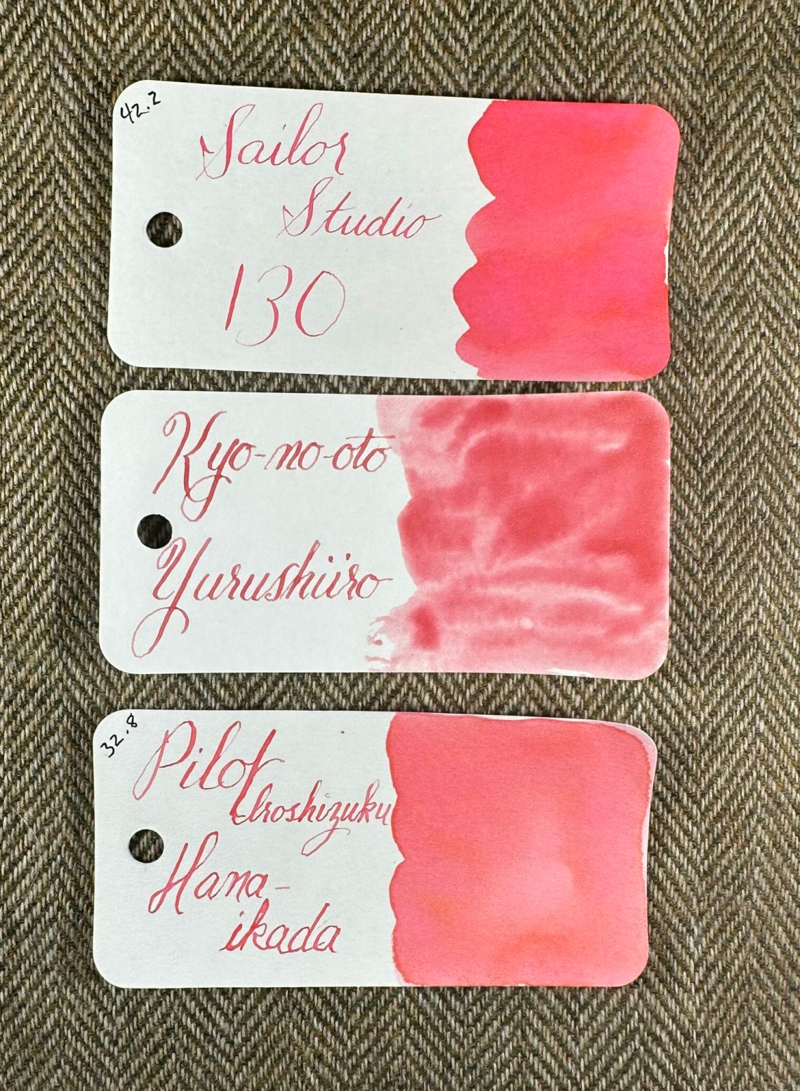
Again, Yurushiiro has the same consistency and comes with the same warning that the ink contains both pigment and dye and that pens should be cleaned out well before refilling with a different ink. In writing, Yurushiiro is close to Pilot Iroshizuku Hana-Ikada (one of the three new inks from Pilot)
On Midori MD paper:
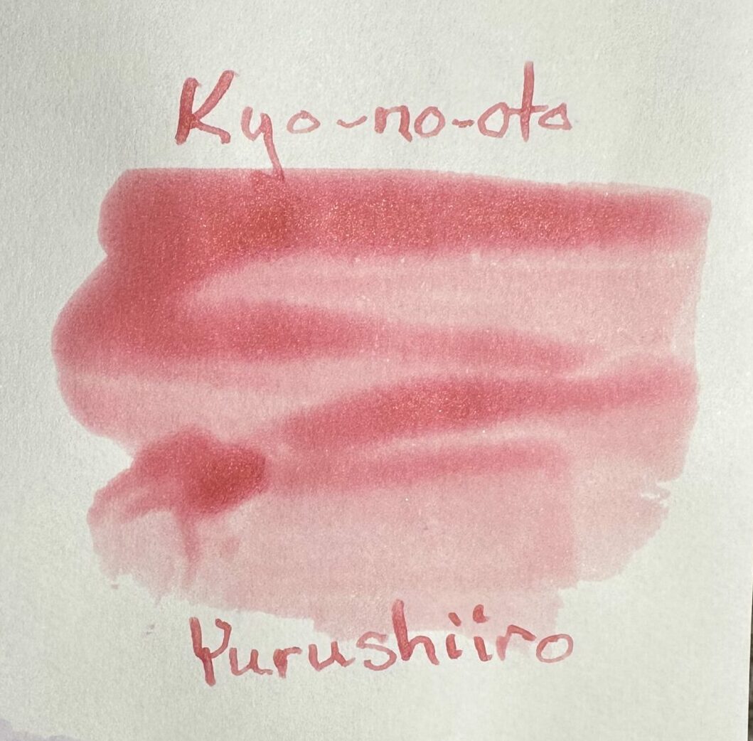
On Cosmo Air Light 83gsm paper:
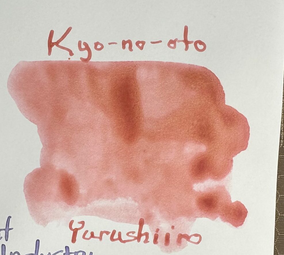
Again the CAL paper but angled to show the color and texture of the ink:

And finally on Tomoe River (TR7) 52gsm paper:
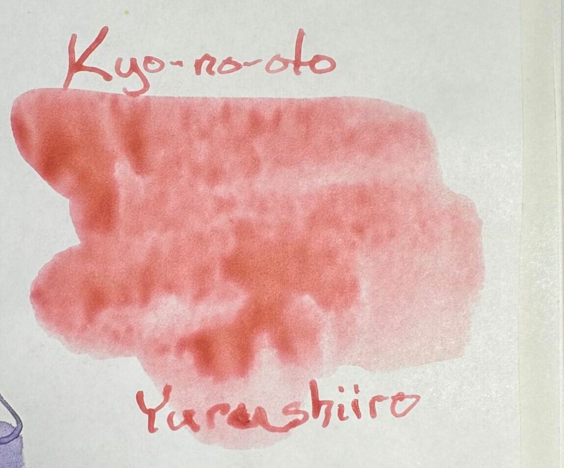
Again, the pebbled texture shows up only on the Tomoe River paper.
What do you think of this new type of ink? I’m thrilled to get a chance to play with it for a while and I’ll report back on the writing experience soon!
DISCLAIMER: The ink in this post was provided free of charge by Dromgoole’s for the purpose of this review. Please see the About page for more details.


What if anything happens with the interaction of nib and particulate? Does it stick to or clog the nib?
I’d be interested to know how you find writing with these inks to be, but I can’t say I much care for either of them. I tend to like brighter colours. These looks as if they weren’t mixed completely. But I appreciate the review and knowing about these inks.
Ruth, I had a similar reaction when I saw Jesi’s swatches. The ink looks gloopy to me. But she says it works well, even in her dry Colorado climate that other TAG inks have proven to be challenging. Weird, huh?
I can’t say I care for the inks either, but even if I did, the price would be a deal breaker. At $0.70/ml these are almost twice expensive as even the more expensive European premium inks (Montblanc, Graf von Faber-Castell, Visconti, Aurora, etc.) and I really don’t see how such a massive difference is justifiable.
I think these colors are gorgeous; but then, I am biased. I love cloudy colors that are not too dark, and I love the shading. And I like the way they sort of “pebble.” Gonna get me some! Great review. Sigh…here I go, buying more ink I don’t “need.”