(I promise the giveaway is real and not an April Fools joke. Just happens to fall on the 1st!)
Tomoe River has been a paper that is loved by the fountain pen community due to the unique interaction between the paper and ink. Ink shows incredible shading and sheening properties on Tomoe River paper and the paper can take a large amount of ink before bleed through is an issue. New Tomoe River paper is manufactured in a slightly different way and the comparison between the two does show differing properties (although the pros and cons of this change are debated).
Since the announcement that the manufacturing process of Tomoe River paper was changing, the interest in new paper types has increased dramatically as stock of the older version of Tomoe River paper dries up. This interest has driven an increase in notebooks using a variety of paper types.
Musubi recently released a notebook using Cosmo Air Light 83gsm paper.
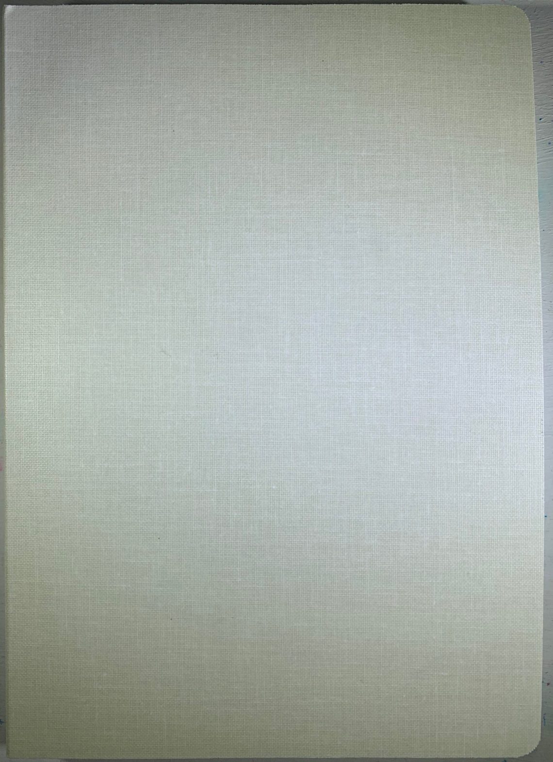
The exterior of the notebook is covered in a light colored cotton and matches the other notebooks in the Musubi lineup of Tomoe River paper and Bank paper notebooks. Each notebook is a slightly different neutral color.

The Cosmo Air Light folio notebooks are available in blank, 7mm lined ruling, and crossgrid paginated. my Cosmo Air Light is the blank notebook (blank is best!)
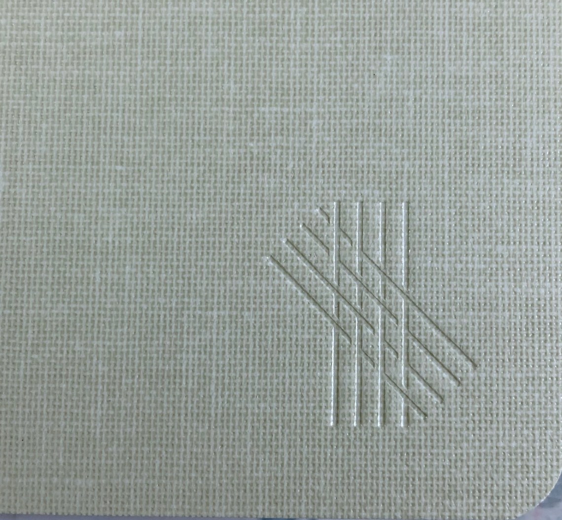
As with all of the Musubi folios, the notebook is only branded on the lower right corner of the front cover.
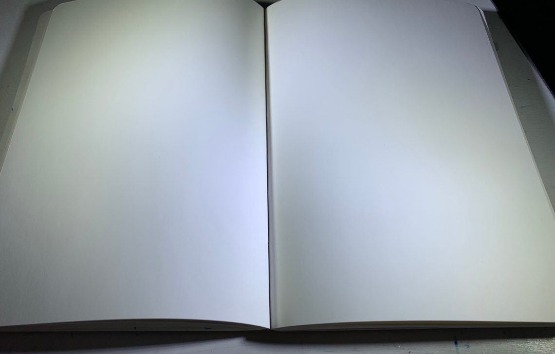
Musubi CAL lays flat and stays open to your page although new notebooks might need a bit of encouragement at first.
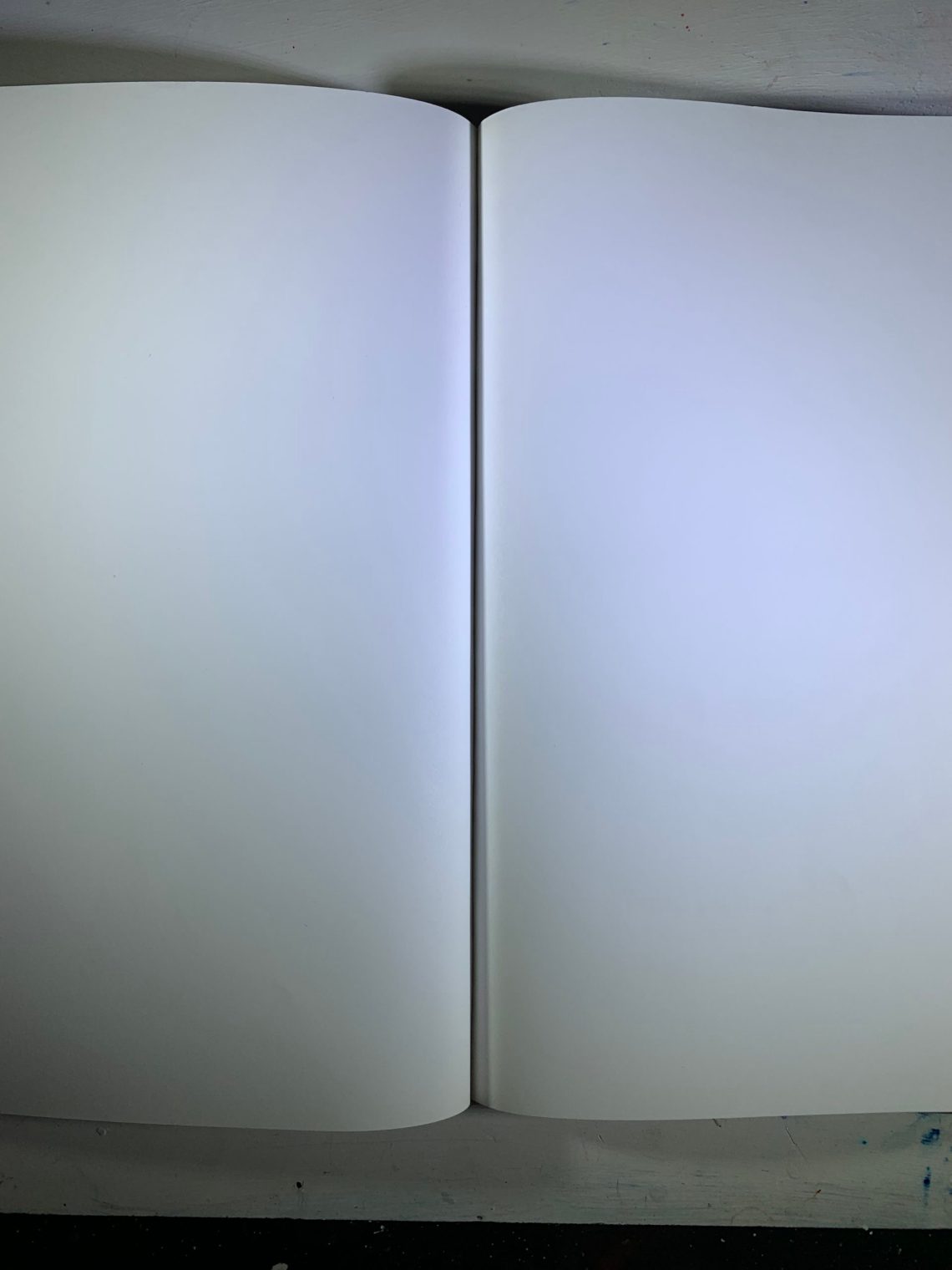
The Cosmo Air Light paper has a very slight color – somewhere between white and ivory. It was hard to notice this color during use.
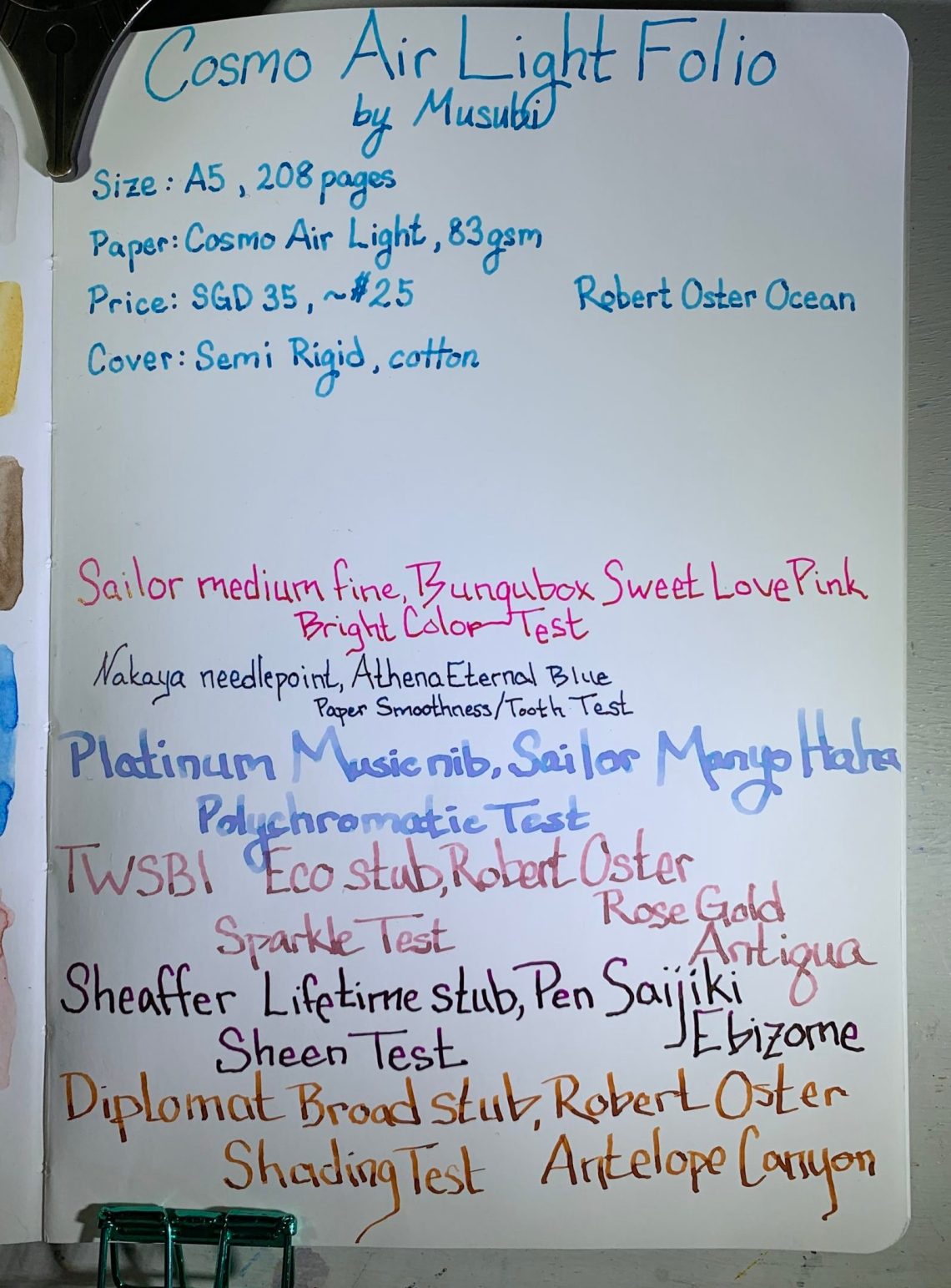
I tried to test many different characteristics on this paper – bright colors, shading, showing multiple ink colors, sparkly inks, sheening inks. Above is the front side of my testing page, below is the back of the same page.

There is a slight bit of show-through with Cosmo Air Light 83gsm, but very little. The camera actually picks up more show-through than what is seen in-person. Sheen is another piece that is hard to show here – it is quite high in-person.
To show this comparison a bit more clearly, I ran the same tests on a Musubi Tomoe River folio.
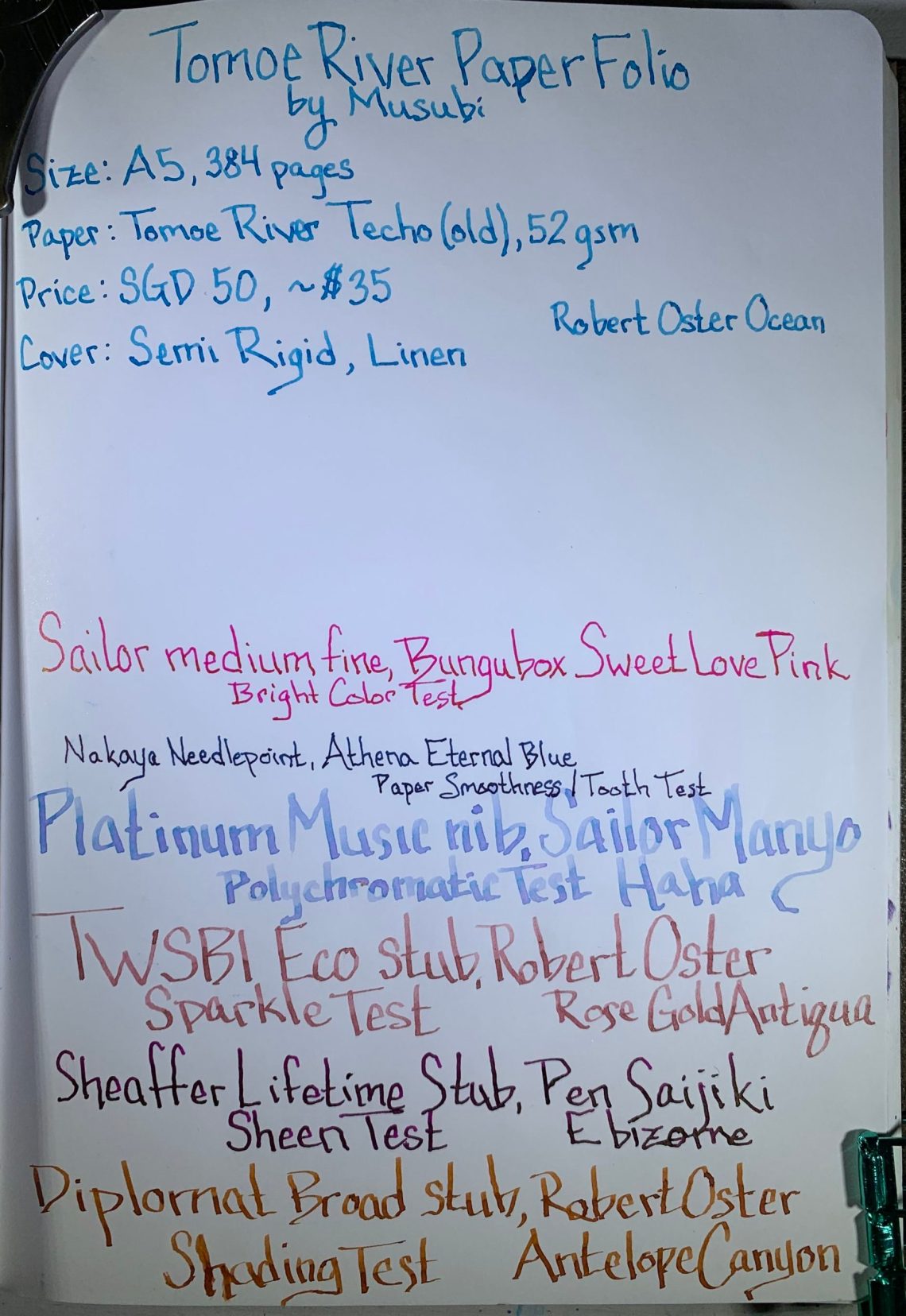
Above: Front side
Below: Back side

Cosmo Air Light paper:

Cosmo Air Light paper with watercolor, front (above) and back (below)
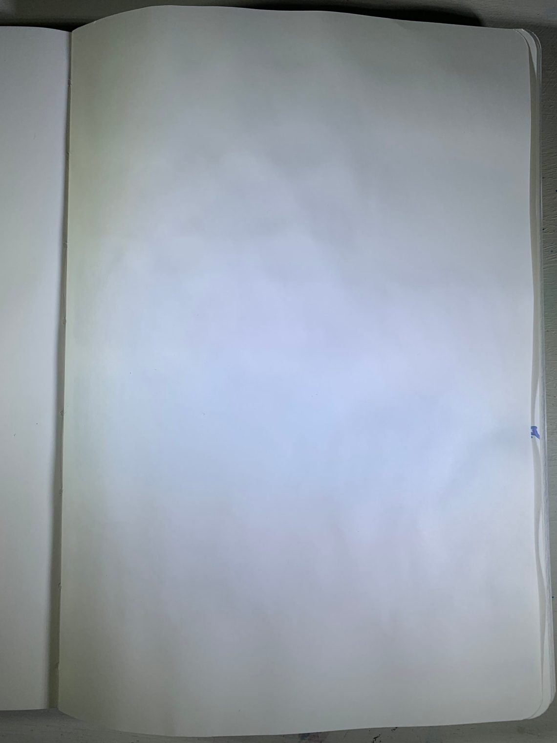
Tomoe River paper:

Musubi Tomoe River paper with watercolor, front (above) and back (below)
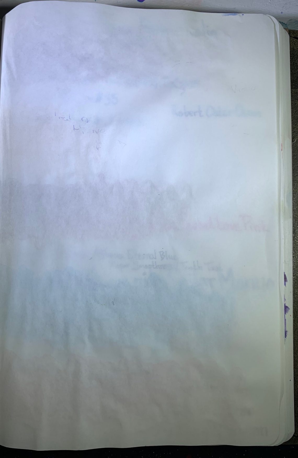
Cosmo Air Light paper is thicker, less show-through, doesn’t wrinkle as much with water, and shows brighter colors than the Tomoe River paper. I did notice that the back side of the Cosmo Air Light paper appeared shiny after the watercolor had dried:
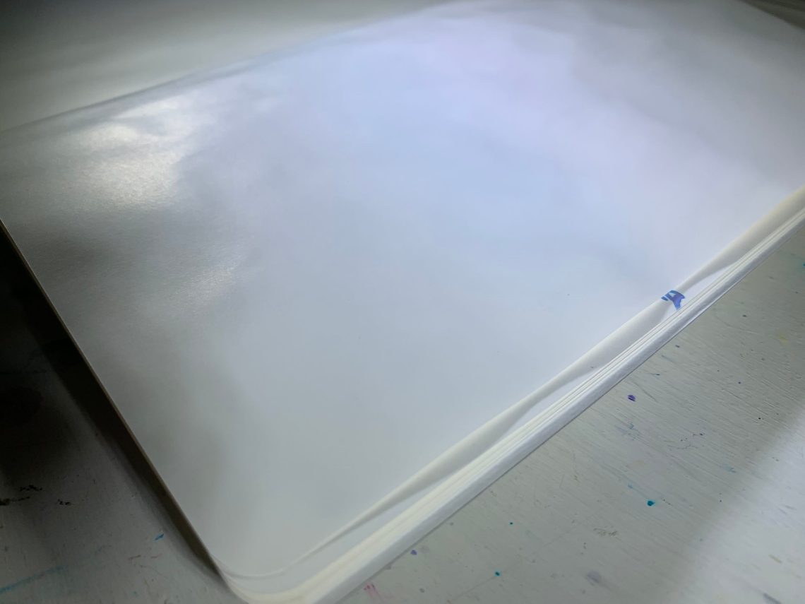
The back side of the paper with watercolor was still great for writing – the shininess didn’t affect the quality.
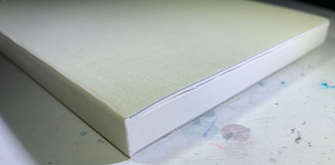
After the writing and watercolor, the pages only showed slightly when the notebook was closed – no major wrinkling even with the water.
To wrap up the comparison, here’s a short list (TR for Tomoe River, CAL for Cosmo Air Light):
Size: TR A5, 384 pages; CAL A5, 208 pages
Price: TR $35; CAL $25 (approximate pricing from Singapore currency)
Paper weight: TR 52gsm; CAL 83gsm
Sheen: More from CAL
Shading: Crisper shading from CAL
Color brightness: Slightly brighter on CAL
Multiple ink colors: More from TR
Shimmer: Equal
Show-through: CAL has significantly less
Watercolor: Brighter colors from CAL, easier to blend on TR
Water resistance: CAL superior
Smoothness: CAL has more tooth, TR smoother
I love this new Cosmo Air Light folio. Downsides include number of pages – TR has nearly twice the number of pages, although the CAL does reflect this with a lower price. CAL also shows ink as crisp – very crisp. This could be good or bad – to me it is just different.
I am incredibly impressed with the quality of this new folio and the paper. I do mourn the loss of traditional Tomoe River paper, but at the same time, I’m very happy that this change is motivating new notebooks. I have expanded my daily notebook pile to include a Cosmo Air Light folio and I expect to replace it as soon as it fills up – I’ll also be expanding ink reviews to cover the ink on CAL in addition to TR. This new paper won’t take the place of TR in my heart, but I couldn’t be happier with the quality of the new Cosmo Air Light notebook. Thank you so much, Musubi!
Another thank you is due to Musubi as well. They recently contacted the Well-Appointed Desk to ask if we would give a new Cosmo Air Light notebook to a reader of the blog! In order to enter to win, leave a comment with your favorite feature of the new CAL paper. Details and rules are listed below.
DISCLAIMER: The item in this review was purchased by me and no affiliate links are provided in the post. Please see the About page for more details.
TO ENTER: Leave a comment below and leave a comment with your favorite feature of the new CAL paper. Play along and type in something. It makes reading through entries more interesting for me, okay? One entry per person.
If you have never entered a giveaway or commented on the site before, your comment must be manually approved by our highly-trained staff of monkeys before it will appear on the site. Our monkeys are underpaid and under-caffeinated so don’t stress if your comment does not appear right away. Give the monkeys some time.
FINE PRINT: All entries must be submitted by 10pm CST on Monday, April 5, 2021. All entries must be submitted at wellappointeddesk.com, not Twitter, Tumblr or Facebook, okay? Winner will be announced on Monday. Winner will be selected by random number generator from entries that played by the rules (see above). Please include your actual email address in the comment form so that I can contact you if you win. I will not save email addresses or sell them to anyone — pinky swear. If winner does not respond within 5 days, I will draw a new giveaway winner. Shipping via USPS first class is covered. Additional shipping options or insurance will have to be paid by the winner. We are generous but we’re not made of money. US and APO/AFO only, sorry.


I really appreciated how you used different nibs and inks on the same page to show the different attributes of them. As I am familiar with how only certain kinds of papers really showcase the special properties of inks, it was very informative. I like Tomoe River paper but find it a bit thin. After reading your review out loud to my cat, both she and I think we should try one of these notebooks.
I haven’t had a chance to try the paper yet but I love shading in my inks so if it’s crisper on CAL I’m in
I love the no show through because I like to write on front and back of pages. Impressed with the water color test.
I love having pronounced shading and sheen so I choose papers that are good for that. Everything I’ve heard about this paper sounds like it’s perfect for inks and shows them off beautifully. I am also very curious about the “velvety” texture.
My favourite feature is less show-through!
It’s hard to pick a favorite feature, but I guess I’d go with the sheening qualities in the Cosmo Air Light. I’m eager to try one of these notebooks – I love the old Tomoe River, but wasn’t fond of the ghosting on the thin sheets. This paper seems like it ticks all of my fountain-pen friendly wishlist boxes!
My favorite characteristic of CA is the color fidelity. It’s just gorgeous1
I’ve tried it, and while I love the slight texture to it, it seems like it’s sensitive to hand oils. At least to mine. But It’s scratching the itch of me missing Midori Cotton, a bit, so I can definitely put a bit of blotter paper under my hand to take care of that.
There seems to be very little bleeding or show through. I love this feature since I can use both sides and save some money (and be environmentally conscious).
Awesome review! I like the price point lol but I really like the reduction in show through. I have leaned away from TR in the past as I can really only use the front of the paper with dark inks in broad nib pens. These look awesome.
I like the subtle look of the cover and how it says fairly flat when open.
I like the paper is blank. No dots, no lines, just blank which means I can do whatever I like without feeling like I’m breaking the rules or doing something I shouldn’t be!
Very excited to try out this new paper. The lack of show through is a real plus.
Wow! I’d love to try watercolor in a notebook! I’ve always been hesitant since I didn’t want to ‘ruin’ a whole notebook with one attempt. This looks amazing!!
I love lay flat bindings!
Very thorough thanks
I actually like the lower number of pages. As much as I love TR paper, sometimes an immense page count put me off from picking up a TR notebook for casual use. (If I didn’t use the whole thing, there’d be so much wasted paper!!) I also love Musubi’s understated bindings.
I’m going to be honest and say that TR will continue to be my favourite as I love polychromatic inks especially, but I like the lack of ghosting on the CAL paper. Lay-flat bindings are also a good thing 🙂 and I’d be very interested to try this paper out.
The sheen looks sooo good!
From your review — the tooth of the paper and the crispness of the ink. I will be trying this new paper.
Would have to be the paper. I’d love to see what my shading inks could do on it.
What I like about the new paper? That I haven’t used it yet! It’s new! So a new experience that I get to have when I can try it!
Many thanks, as always, for doing these reviews. I think my favorite feature is the relative lack of show-through. The fact that it has a bit of tooth is also very interesting. I think I’ll get one of these just for fun (Lord knows I don’t NEED another notebook, but ….)
I haven’t gotten to try CAL yet, but I’m looking forward to this shading!
I tried this paper in a sampler, and it was fun to write on. I think I like the shading on it the best so far!
I like the weight combined with the shading properties you can get.
I like that it lays flat and stays open to your page.
I agree with many of the commenters who said the minimal show through is a plus. I tend to use both sides of the sheet, but for some of my notebooks that is almost I possible due to show through. Thanks for the give away!
Cal has more tooth is both a benefit and a mind picture of a anthropomorphic piece of paper with teeth named Cal.
I love the shading properties. That is always what I look for first in a pen/ink/paper combo.
Loving the look of the cover and the fact that there is very little show-through. Also like that the color is brighter that the TR paper.
Less show through has me intrigued.
Interested to see the high contrast and crispness of the ink.
I’ve never heard of 83 gsm Tomoe River Paper before. Good know they exist! Thanks for the giveaway!
I’d be tempted to try this one because I’m
Always looking for papers that will allow sheen to show more strongly. Agree with others that fewer pages might actually be better and get me to use a TR notebook more than I have in the past. I’ve stuck to individual sheets for the most part.
I’m sure I’ll love the CAL paper & notebook…either the one I win or the one I eventually buy 😉
Super excited for high shade with less show through.
I usually use an extra fine point nib on my fountain pens, but I recently bought some larger pen nibs to use with the sheening inks I have in sample sizes. This paper would be great to use for that. I like little show through since I always write on the front and back pages. As for the notebook itself, I like the cotton cover, the lay flat binding, and the blank pages.
I like the fact that ghosting is minimal on the CAL paper. I think Tomoe River is all hype
I a very interested in how the CAL paper handles watercolour and heavy washes! Thank you for the giveaway opportunity!
I love sheen and shading; fountain pen ink just comes alive on this kind of paper. Thank you for the opportunity to potentially win this notebook!
A paper that gets more mysterious with each review. Who would have thought? So I slid from vague interest to a conviction I had to try it. Can it compete with Tomoe River? Does it have to?
I like that you can get them blank and that they seem similar (possibly better) than Tomoe River. That alone makes me want to try one. The cover texture looks interesting, too. 🙂
I don’t know that I have a favorite, but I really want to try it and found out if I like it.
I love the crispness and shading of the ink in the new notebook! I’d love to try one.
So excited this was finally released by Musubi. I have been waiting for it since it was announced last year. CAL is some awesome paper and dare I say it I actually like it better then Tomoe River. Can’t wait to get my hands on one of these sweet note books.
I am super excited to try out Cosmo Air Light paper, so thank you so much for doing this review and giveaway! I’m especially fond of (and chase) sheen in inks (which is why Rhodia and Clairfontaine are not my favorite papers), so it’s very good to hear that CAL is equal to or even exceeds TR in this aspect. I’m also drawn to how inks look brighter, crisper, and pops out more on CAL. (In contrast, inks that I love the color of on TR look drab on Rhodia.) So all this is very good news!!
Fortunately I haven’t fallen into a polychromatic ink hole yet, so this downside is not too lamentable! (Yet..!) The amount of ghosting on TR never bothered me, so I will have to wait and see if I still prefer the thinness of TR over CAL. Overall, Cosmo Air Light sounds like it might become my second favorite paper after Tomoe River paper!!
Less show through and nice shading!
I’m actually kinda a fan of the fact that it ever so slightly widens the line a bit.
Oh this paper looks wonderful! I think I like how it plays well with water the best. I use my fountain pens and notebooks mostly for sketching and love to add some watercolor effects so I’d really like to try this paper. Thanks for the giveaway opportunity!
I love to use watercolors in my notebooks so I am very interested in trying this one!
It is interesting that the backside turned shiny from the watercolor. My favorite feature is the sheen. I need good paper for sheen inks!
Ooooh. I like how it takes watercolors.
Interested to see the crispness of the colors along with less show through.
Less show through. That’s key.
The lack of show through seems great. I’d love a chance to try it out!
Love the cotton cover and that I can get it in lined sheets!
This paper looks very interesting. I like that the show thru is minimal on the revise side of the page.
I really like the lay-flat binding. The brightness of the paper is also really nice. The ink pops off the page.
I like the look of the cover. The low show through and bleed through is also very nice. I’m looking for a notebook that works well with fountain pen ink but doesn’t show too much.
Sheen and shimmer friendliness are what I like! Ahhhh!
I’ve been impressed by the sheen on the CAL sample that I’ve tried. Inks that sheen really come alive on this paper – even compared to TR.
Very interesting paper—I’d love to try it. Not sure about the extra tooth vs. TR, but the crisp lines and less show-through sound fantastic. Those gray fabric covers are very handsome as well.
I hope someday to see some more interesting paper types, such as high quality coated paper, where the coating interacts with ink color and finish. I have one such notepad, and it’s a lot of fun with fountain pen inks, but it’s tiny in size, and I haven’t been able to find similar paper anywhere else yet.
I love the shading and the crisp colour of the inks. Not CAL specific but the minimalist style and beautiful execution of the Musubi products are simply amazing. I also like that this notebook has less pages than TRP notebooks. I am on page 131 of a 496-pages Elia Notes and a bit torn between fully appreciating the old Tomoe River paper and longing for a new notebook to play with. I vow to finish the hell out of my Elia Notes and make the most of it though.
Ooh the shading and sheening qualities stand out most to me. Would love to try this for fountain pen paper post old tomoe river.
CAL feels like writing on your favourite soft cushion, whereas TR is like glass in comparison.
CAL has more shading and the colours just pop, however I am one of the people who get annoyed by all of the wider line strokes being written. CAL makes all of my nibs write broader and I don’t like that.
That is something to be aware of to all. There are a lot of comments about this.
Over all though, the CAL feels great to write on but it won’t get me away from TR, ever.
(I’m in UK so miss out on the GAW chance, but thanks for the good write up)
I’m excited for the less show through. .
I’m excited by the thicker page and less show through so I can write on both sides of the page. I do a lot of journaling, and I’m literally leaving half of my TR notebooks blank. I also love the description of the shading as “crisp.” I think I know what that means and I really like it in shading inks. Really hope to get to try this notebook!
For CAL I am most excited about the lack of show through. I also like that this notebook lies kind of flat.
I really like the cover – the color, texture, and the understated logo.
Wowie, I’d seen a bunch of hype for this paper but this review really helps me understand what the big deal is.
I like that it seems to make lines a bit thicker than on others papers. My fine points look almost like mediums on CAL.
While I mostly use pencils (and as such wonders how this paper behaves with different pencils), this new CAL paper sounds fantastic when I read the review! It sounds perfect for some light aquarelle/aquarellable pencil use on the go.
My favorite feature is that the Musubi CAL will lay flat and stay on your page!
I love the color of the page. It’s so subtle. Also a huge fan of the cover here. It’s so gorgeous!
CAL for the win due to toothiness and low show thru!!!
I haven’t tried CAL yet but am very much looking forward to it! Thanks for the review and giveaway!
I like the fact there was little/no show through in your photos – got to use both sides!
The toothiness interests me. I like to use colored pencils and this sounds promising for deeper color.
Great review! I JUST ordered one from Musubi and a bank paper folio. I can’t wait to experience it. Looking forward to comparing the two with TR. Expecting a slight tooth, which would be good for everyday writing.
I love how the paper takes to water colour. Though I am curious as to how the paper takes to rewetting and repeated working over with water colours. I will admit that I was annoyed with the buckling of my TR paper notebooks, and this gave up reworking water colour sketches in TR notebooks.
I haven’t tried it yet, but love how thorough this review is! From the above I like that it’s slightly thicker and so corrals some of that show through!
I love how bright the inks look on this paper!!
The texture of the paper looks great, it would be fun to try it. And the cover is really pretty!
Aside from the cushion-like feeling, what I love the most about CAL is the “spread” it shows. I’ve turned a lot more towards broader nibs, so I find myself using F nibs less and less. This paper gives them a bump in size and in my heart!
The cover is lovely and “crisp” sounds just right for journaling. I guess they don’t make paper that is rambling, so I’d go for crisp journal entries.
I like what you said about it showing colors brightly. This paper has been getting a lot of buzz lately and I’m interested to try it!
Love the color and how it makes shading really pop!
Definitely gotta go with the sheen. This is just a lovely paper in general. Well worth it. And Musubi products are incredible.
Ink shading looks great!!!
I also love the look of the covers for the folios because of that texture – dare I say even more than some of the diaries?
I love crispness and shading in CAL. I hope there’s still quite a bit of talking to be had as well. That notebook is beautiful!! That kind of texture on the cover is really enjoyable for me.
I haven’t personally tried the CAL paper but Musabi journals have been on my wishlist for quite some time. I think the biggest perk for me is the shading, I’m such a shade ink nerd.
The shading looks really nice
Sheen for me. Other papers do other traits well, but replacing how TR shows sheen will be hard. Would love to try it out myself!
I am always looking for new paper to test it, and if they are notebooks, better. I like Tomoe River, although it has never completely convinced me to use it as a permanent fixture in my writings and stories. Now, the arrival of the Cosmo Air Light Folio gives me the opportunity to try something new and, most likely, use it as my journal. The characteristics that attract me the most about Cosmo Air Light Folio are the increased sheen and the crisper of a greater shading, as well as the brilliance of the writing and possibility of better water resistance. I wish I already had it to test it and continue with it as my favorite role.
I love the smoothness of CAL!
There’s so many great features but I love how it shows just as much sheen and shading, if not more, than Tomoe River paper. I’m actually happy there’s new types of superior fountain pen friendly paper coming out, it’s good to have more options.
I have never used Tomoe River paper or anything like it. Inconceivable, right? So winning would be a thrill! Thanks for the giveaway!
Thanks for taking the time to put together the review. I love shading inks and this looks like another winner for showing that property off. Love the straight-forward cover too.
I love having access to another type of interesting paper.
I just picked up a pack of this, and am not sure if I love it yet. We shall see. I would love to play with a notebook of it. Maybe if Daryl comes out with his cover, I will get one with this as a refill.
I love when thin lovely paper crinkles with watercolor.
I’m excited that there’s more sheen and less show through with the CAL. Sounds impressive to me!
My favorite feature would be that the ink shading is crisper in the Cosmo Air light paper that in the Tomoe River’s. For me, shading is the most important aspect for an ink.
Thank you for the review, I recently found out about this paper in a podcast (@tinteriaspodast in IG) and was very curious about it. Good job in the comparison and everything!
I love the subtle covers and the heavier paper stock! Looking forward to getting my first one of these, weather in this fashion, or by purchase
Love the color brightness and shading!
I went down a rabbit hole when I saw one of these posted on IG. This looks great for a journal. I like that appears to handle a variety of inks without much show through at all.
This paper makes you fall in love with your inks all over again!
I tried this paper out a couple months ago and I was pretty impressed! It’s nice having more high-quality paper options than even just a couple years ago.
I’m liking the no show-through (or very little) about this paper. Since I love drawing with different pens and inks that’s important to me. Thanks for the giveaway opportunity!
I like the cotton/linen cover. I also like that the journal pages lay flat. Did you know that Musubi are also a popular snack of a slice of Spam lunchmeat surrounded by rice and wrapped in seaweed? 🙂
Less show-through would be a nice feature compared to TR. Thanks for the comparison!
Two things I like about the Cosmo Air Light most are that colors are brighter, and that inks shade so well. I’ve always been #teamshade, and no paper would satisfy me if it didn’t allow for excellent shading characteristics. I do mourn the loss of the Tomoe River we had – we were so happy with it! But, unless we find an even better substitute, I guess it looks like it’s going to be Cosmo Air Light, doesn’t it?
Never tried it but would love to.
I’m most interested in its ability to show off the sheen in my inks. Ability to accept watercolor well is a big bonus!
I haven’t seen it in person yet, but from your review my favorite part is less bleed thru!
I really like all the features about the paper and the logo on the front makes me melt.
Is it weird to say I absolutely love the texture and color of the cover of the notebook? The up close picture of the cover reminds me of cross stitch material and I was obsessed with cross stitch as a teenager!
Happy Easter or Passover, whichever you celebrate!
I like how it holds up after getting wet
Low show through on the backside
I like a lot about this book.
The design is clean, but the cover looks as though it will have an interesting texture, which adds to the hand feel. I like the fact it opens flat. I like that aspect of the Midori MD range, but the finish of these is higher quality, with a fabric cover. The paper also looks lovely – the Midori dries fast and tends to have little shading. By contrast this book seems to have slightly superior handling to Tomoe River for my purposes. I also love shading – sheen and other features don’t really do it for me – so that’s a high point. The watercolour handling also looks pretty good!
Third Musubi journal contest entry. Fingers crossed. I’m curious to see how it compares to Tomoe River.
I appreciate the lack of ghosting. I like to use a fountain pen and also both sides of a page. So the expense of good paper should be reward the writer with the ability to use the paper fully…
I’m excited by the sheening properties – this is probably what I value most about Tomoe River so I’m happy to see there’s an alternative!
Never heard of Cosmo Air Light.I live in Syracuse NY not many places to find decent
notebooks. I am thinking of giving watercolor paints a try.Can you recommend a notebook ?
Thank you for your review! I haven’t tried it yet but am always on the lookout for paper that shows sheen well!
That cover texture is intriguing. I wonder if it’ll wear like a pair of jeans and get softer. And I’m looking forward to a notebook without too much showing on the other side of the page.
I am always looking for new paper to test it, and if they are notebooks, better. I like Tomoe River, although it has never completely convinced me to use it as a permanent fixture in my writings and stories. Now, the arrival of the CAL gives me the opportunity to try something new and, most likely, use it as my journal. The characteristics that attract me the most about CAL are the increased sheen and the sharpness of a greater shading, as well as the brilliance of the writing and possibility of better water resistance. I wish I already had it to test it and continue with it as my favorite role.
I got my hands on a pack of loose leaf Cosmo Air Light and took it to get cut and spiral bound at my local Staples; I have been using it for my second brain ever since! I was a lover of Tomoe but this paper has such a bouncy cloud, cushion-y feel to it that I have grown to love! It makes my nibs glide across the page. It’s like writing on a satin pillow case!
Crisp ink! Love it!
Love that the ink doesn’t show through on the backside!
Thank you for the great review. Very thorough with the mediums.
Probably the lack of showthrough. I’ve been playing with the idea of cross-writing to get more words on a page and paper that shows even less through the other side will make that even more doable!
I’ve got a CAL 75 GSM from Taroko Designs and I love the lower ghosting and less slick feel of the page. Been using it as a D&D character journal. I have noticed unfortunately, that when I write in pencil and erase, the erasing leaves a sort of film behind that makes ink take longer to dry. No other paper I have does this, not TRP, Clairefontaine, Rhodia. I don’t know why it does that. Still love it though!
I was always afraid to try Tomoe River because I use both sides in a notebook and didn’t like the see-through. I’m excited to try this paper out.
I love the extra shading that appears on CAL. Tomoe has long been my favourite, but the new changes have not done it any favours in my book. I’m looking for replacements to bind my journals with, and CAL looks like an excellent contender!
I’ve tried the CAL in the Yamamoto sampler, and looove the shading on it!
This looks like another great option for fountain pen users.