Today’s regular review has been pre-empted by a plumbing emergency that started on Sunday afternoon and still isn’t resolved. However, in the immortal words of Tim Gunn, “Make it work.”
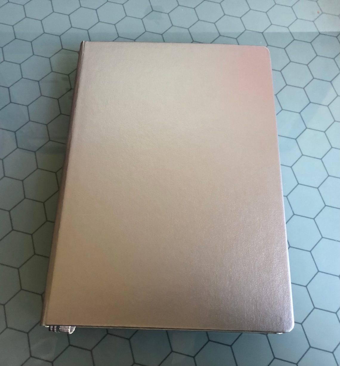
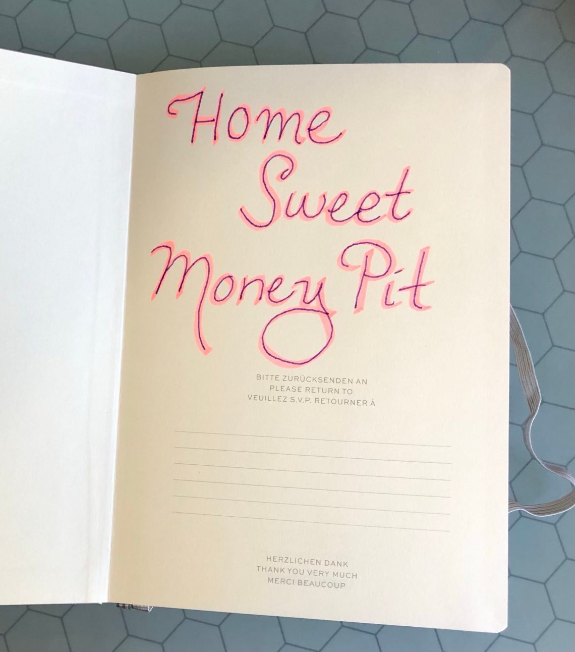
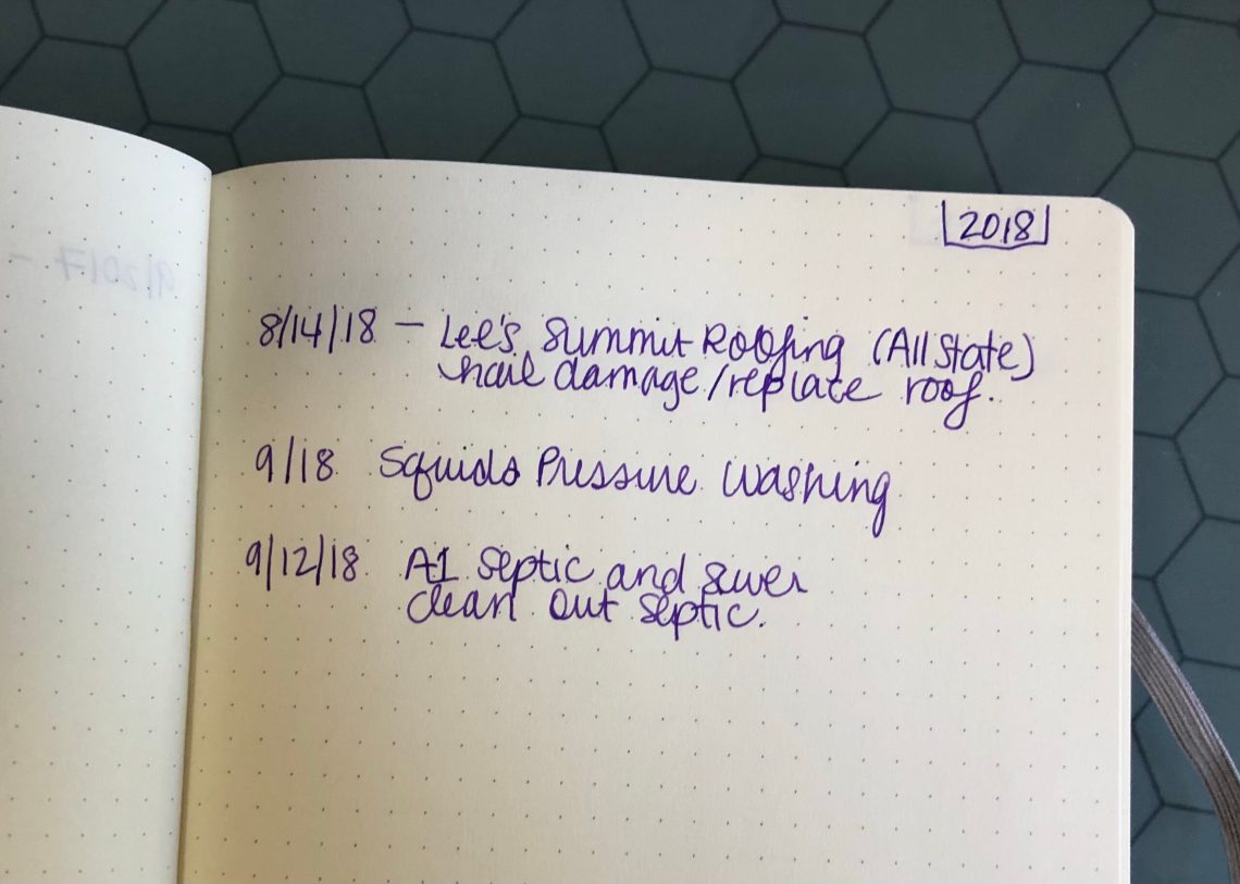
While I tossed and turned in my hotel bed on Sunday night, I realized that the answer to the question “When was the last time you had your septic tank cleaned?” and my blank puzzling for a date/time could be resolved by none other than pen and paper. This morning, when we stopped back at the house, I grabbed a trusty Leuchtturm 1917 Hardcover A5 Metallic Edition. I also approached the file cabinet of doom, and grabbed the extra thick “House” file and took it with me. Today I have been busy building a journal of my house’s greatest and shittiest events (see what I did there?) so that I have dates and repair companies and what type of work was done.
I’ll see you again when indoor plumbing has been restored.
This year, I found my favorite ink color and have proceeded to use it in my daily writers all year. It’s not a particularly rare or coveted ink but, for me, it is exactly what works for me. I am almost to the bottom of the bottle and so I wondered if, in the 100s of bottles of in that I own, I might have a close match.
In the make-up and cosmetics world its referred to as a “dupe”. This term is often used when trying to find a. cheaper version of an expensive item or one that might have only been available in a limited edition kit. While the ink I want to dupe is neither expensive nor rare necessarily, I was hoping that I could use an ink I already own rather than buying yet another bottle of ink.
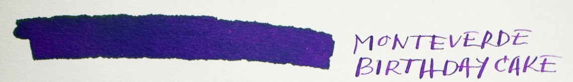
As you may have already guessed from the photos or if you have been following my daily writing journey this year, the ink I have been using is Monteverde Birthday Cake. The 30ml bottle I had cost about $12 at the time of purchase. So, there’s a bit of irony as I try to dupe it with inks that range in price from $12 – $40+ per bottle.
This was not an exhaustive search across every purple/violet ink currently available. Rather, this was a search through my personal collection. We all do it, right? We often buy colors we love over and over again. I like dark smokier purple/violets and so I tend to buy similar hues from different brands.
The Inks
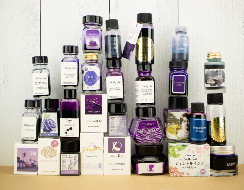
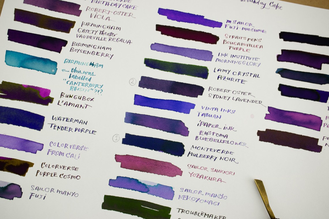
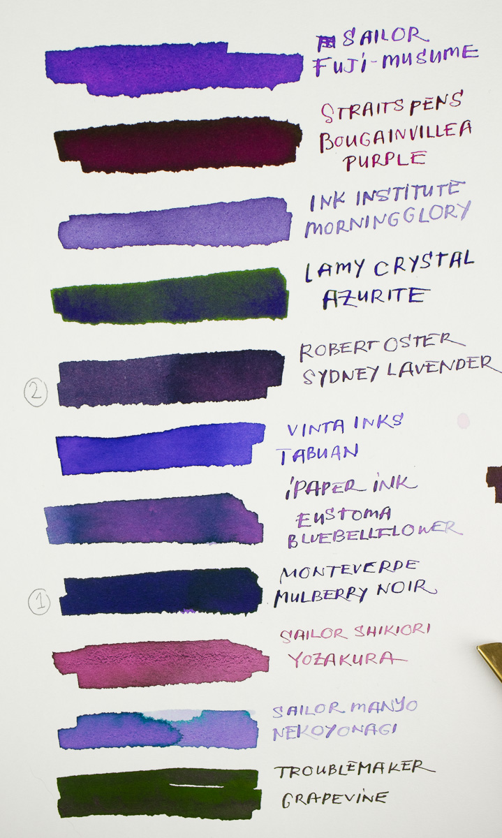
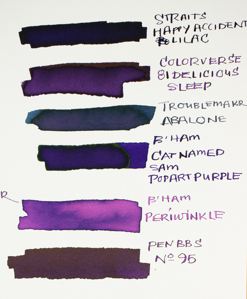
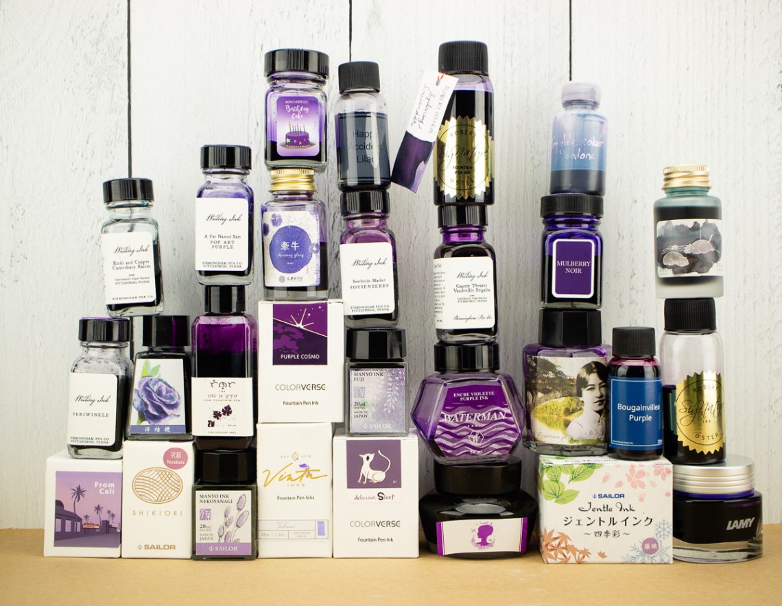
In the end, I found about 27 or so bottles of purple/violet or purple-adjacent inks in my collection. There may have been a couple more but this seemed like a good range. Using a sheet of Col-o-ring paper in my FOLIO pad, I was able to swatch each bottle, one after the other, to get a bird’s eye view of the color range.
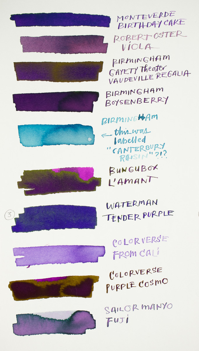
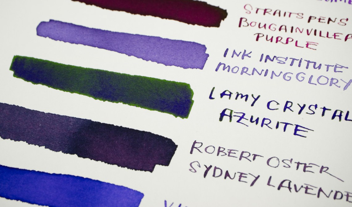
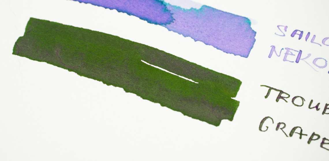
Several bottles were much too reddish purple. And several colors were too sheeny for everyday use (for me) like Troublemaker Grapevine and Lamy Azurite (see below).
The Short List
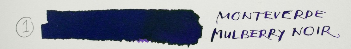
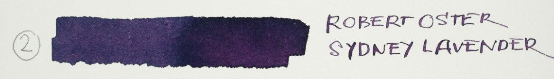
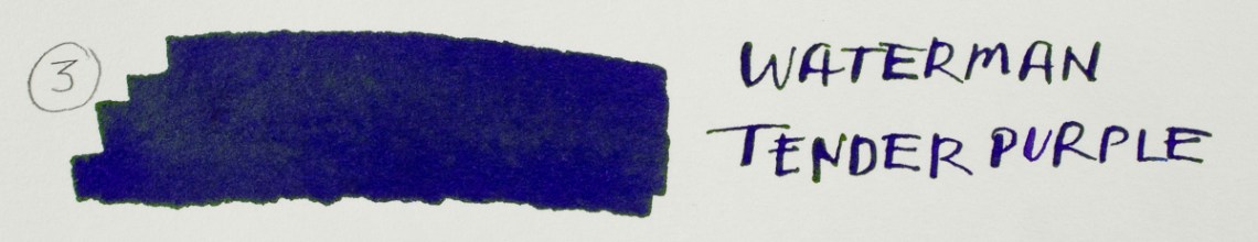
In the end, I found three close matches for me. The closest was Monteverde Mulberry Noir but it is a bit darker. Sydney Lavender has a similar smoky quality but it is much more reddish. Waterman Tender Purple was also a close dupe and probably closest in color but its a bit more saturated and the color sheens a bit.
So, what do you think I decided to do?
Off-Topic!
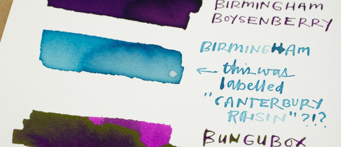
In the process of doing this experiment, I discovered that one of the inks I had dramatically changed colors. What was once “Canterbury Raisin” from Birmingham Pen Company had turned turquoise. this was from their earlier ink batches and the bottle was labelled “made in Germany” so it is at least four or five years old. My inks are stored in drawers to keep them out of the sun so this was quite a surprise. I have a swatch on the lid of the bottle showing the color to be closer to Sailor Manyo Fuji — a bit of a shifting color but definitely a purple color. I talked with some of our Patrons about it and they each had a similar tale of an ink in their collection shifting colors. Has this happened to you?
In Closing
If you decide to attempt a similar experiment with a favorite ink color, remember that the pen nib size and the paper you use may alter the experience. In my case, I am using Stalogy paper and a Fine nib in my Sailor Pro Gear Slim as my daily carry. I discovered when I switched nib to an EF, the ink color altered slightly with more shading range making my experience less consistent. This is definitely something to consider when deciding if you like an ink: try it in a couple nib sizes and on a few papers. This is a prime example of YMMV.
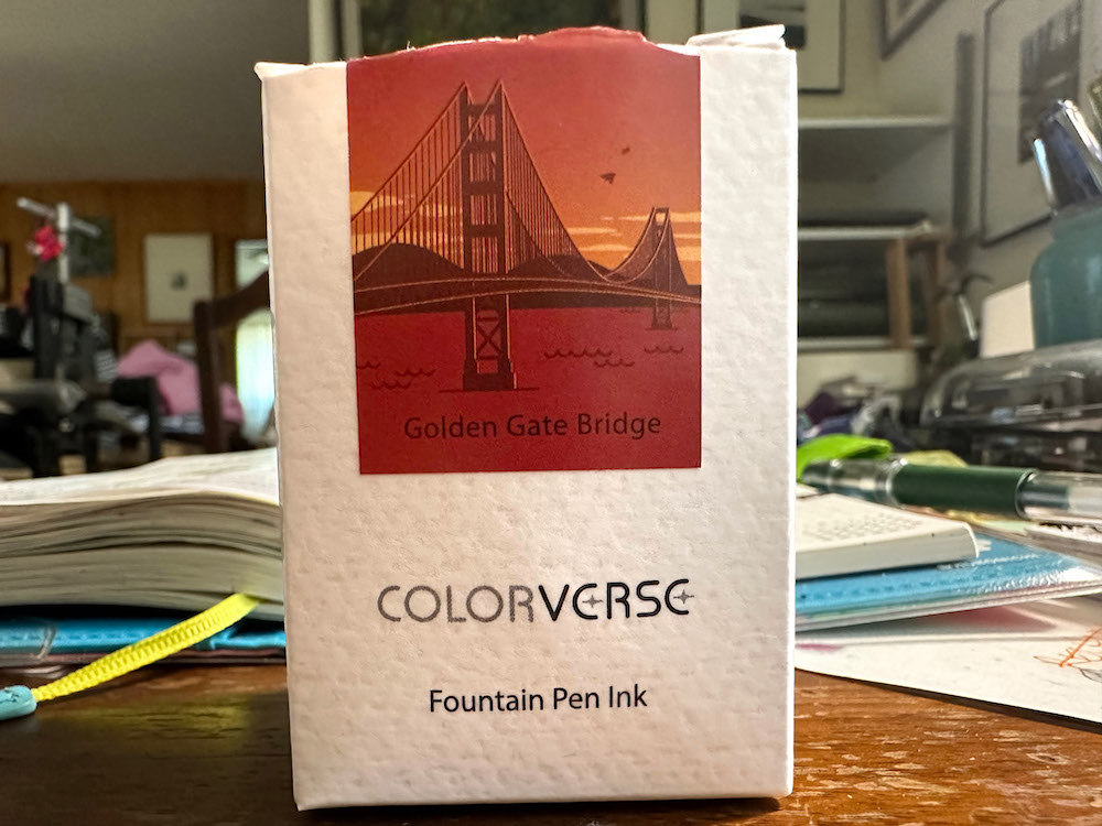
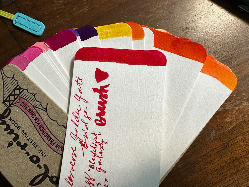
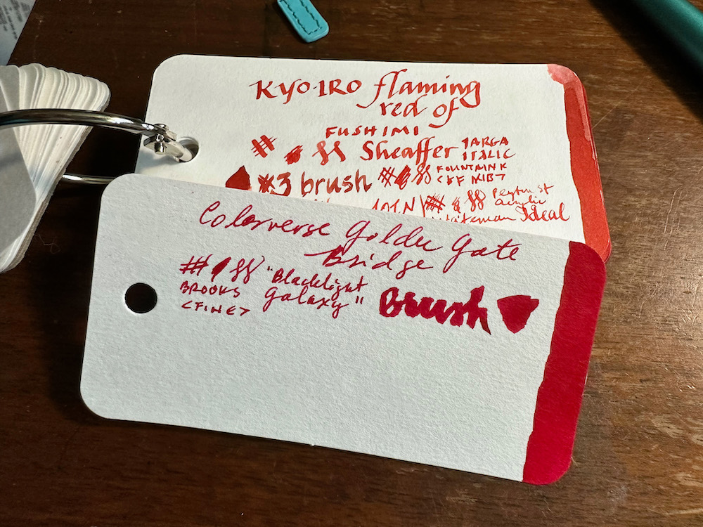
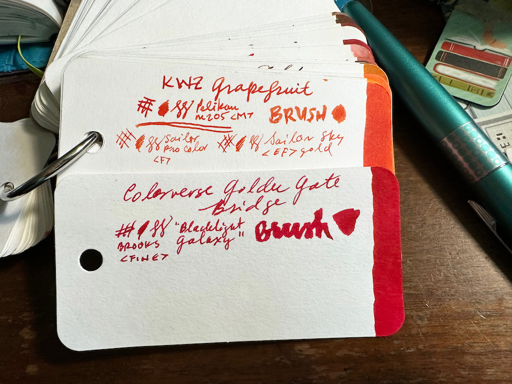
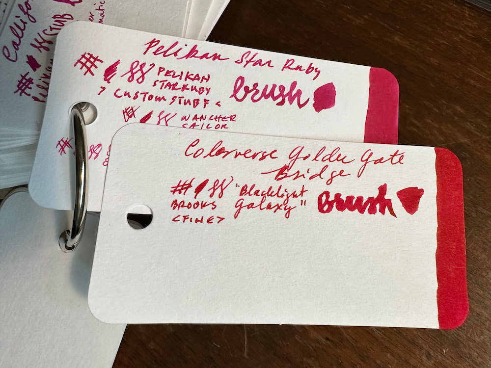
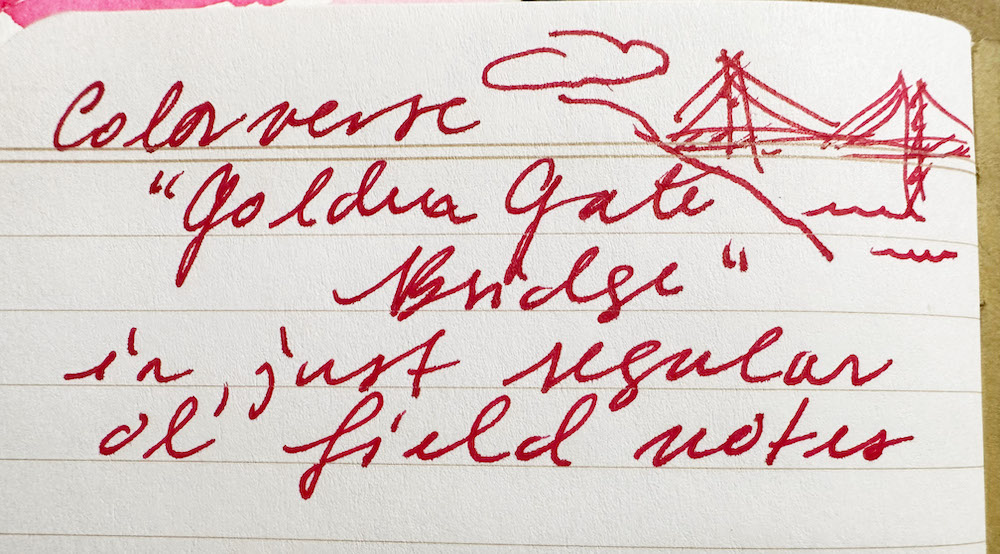
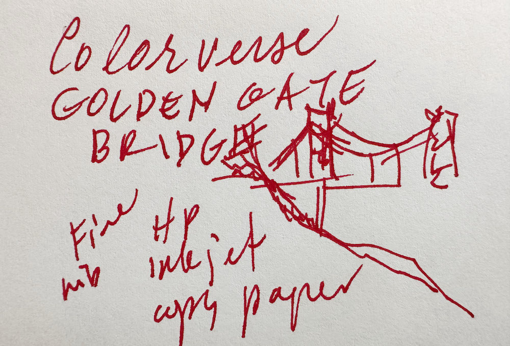
Colorverse “Golden Gate Bridge” is the “Show ink” for SF pen show 2023. I was excited to see how Colorverse would interpret such an iconic color,which can be hard to pin down. Is it orange? Red? Red-orange?
As a Bay Area native, I learned early that the paint color is called “International Orange” (only do an image search on that if you are wearing sunglasses), but as it appears on the bridge itself, it is a deep and rich vermillion. This color is not-red, not-orange, not-pink, an elusive beauty much like the deeper shades of coral.
In this review, I compare the ink with others in my collection, write on a few different papers with a fountain pen, and paint with the ink using a brush in my Art Test.
What is the color like?
The ink is a saturated, non-shading color. I found it to really resemble the bridge color when the ink is wet, but dry to a more magenta-leaning shade.
Some Col-o-ring comparisons
Here it is compared to the colors I have in this general range. You can see it struggling to fit in!
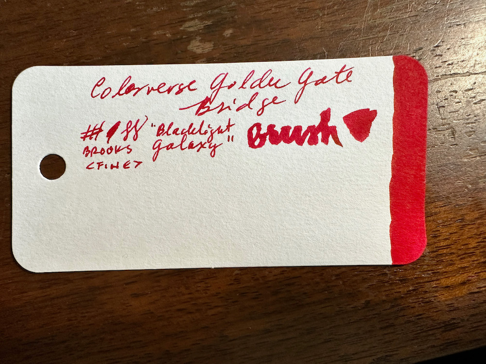
The closest “red” shade I have is Kyo-pro “Flaming red of Fushimi”. This comparison shows how much more saturated, GGB is, and how it has leans away from the yellow-orange tones.
I thought KWZ Grapefruit would be a good match. In this comparison, more shading is evident in Grapefruit, as well as the yellow-orange tones.
Possibly the closest match from the inks in my collection is Pelikan Edelstein “Star Ruby”. This ink to my eye is straight-up magenta. GGB next to it appears just a bit more a true red, but matches the saturation level really well.
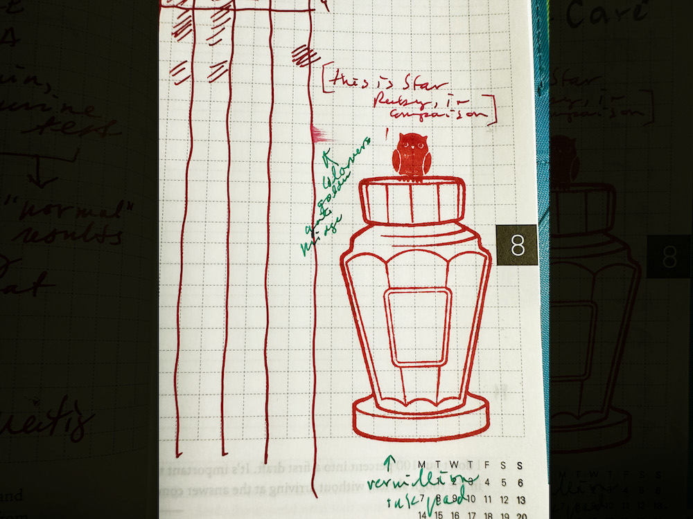
To further illustrate this point, I have an entry from my Hobonichi Techo, which shows lines in a Fine nib of GGB to the left, a short sentence written with Star Ruby in a Fine nib to the right of that. For extra credit, the rubber stamps were inked with the Ranger Archival Ink stamp pad in the color Vermillion! In a Fine fountain pen nib, there is very little difference in perceived shade of the two inks.
Note: The owl rubber stamp is part of a collection I bought from the Hobonichistore, and the lovely ink bottle stamp is of course from the Well-Appointed Desk! One of my favorites in there. But I digress.
Standard Paper tests
So far we have seen the ink with Col-o-ring paper, and Tomoe River paper. What if all we have are a standard Field Notes book, or some copy paper?
In the Field Notes, I detect a little bit of feathering, if I look closely. Slight show-through on the back, but usable on both sides for sure.
As for the copy paper, I have HP 24lb bright white inkjet paper for my own printer. I found the ink to behave pretty nicely on this paper, with a little bit of feathering visible and minimal show-through.
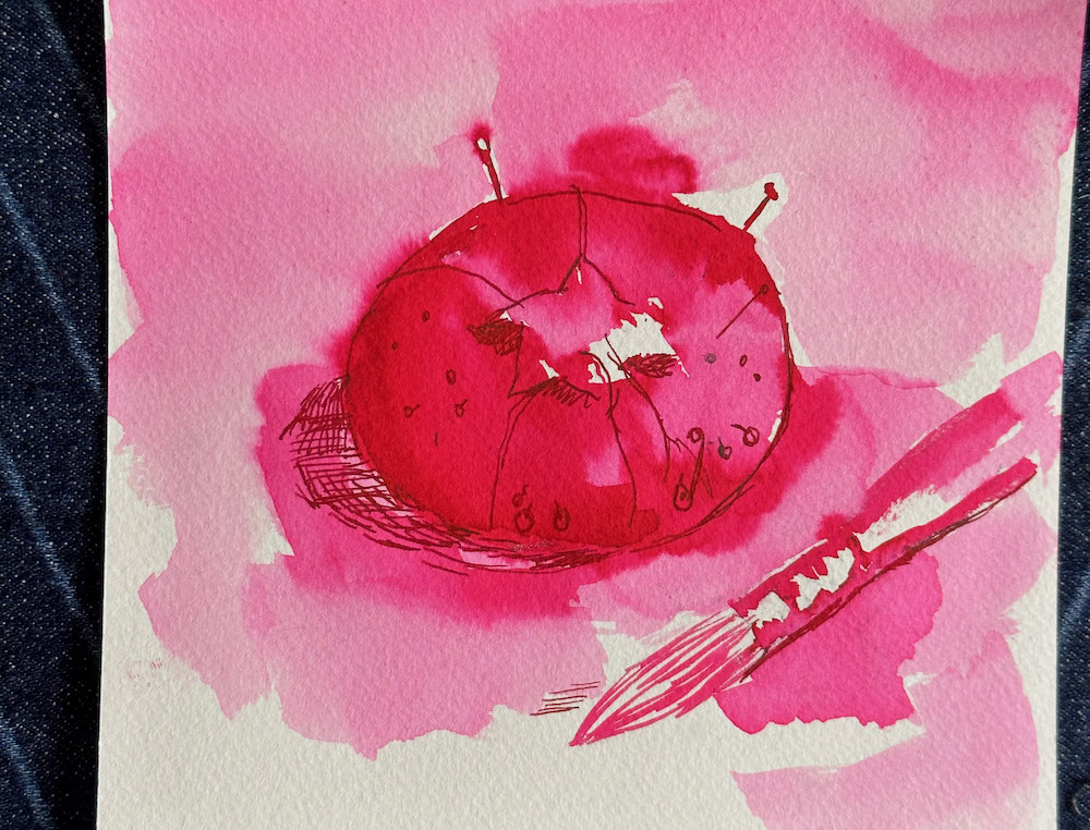
The Art Test ™
If we have met before, you knew this was coming! The best way I know to discover the true range of an ink, is to paint with it. I use the ink direct from the bottle, as well as dilutions with water. The paper is cold-press watercolor paper. For this piece, I started out with pencil, then used various dilutions of ink and water for the light wash effect. I built depth and shading with straight ink, and when dry, drew fine details with the ink in my fountain pen.
From the lightest light that I could get with dilutions of water, to the darkest dark with fully saturated ink, there are not too many middle shades in this one. This tracks for me in how saturated a color it is in the pen.I also see clearly in the painting, how magenta the lighter shades are. The darkest areas looked more vermillion and had more orange tones when wet. With the detail lines in place, I can see there is a bit of sheen on this paper, which shows more of the warmer hues. I have posted a VoiceOver narration videoof my process YouTube while painting this piece over on YouTube, for those curious to see the painting unfold in real time.
TL;DR
Colorverse Golden Gate Bridge is a bright, saturated color. It writes well on a variety of papers. The wet shade is an orangey vermillion, which dries to a magenta-leaning red color. There is no shading, but a bit of sheen can be detected with more intense applications.
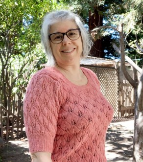
Julia van der Wyk is an artist, classical musician, knitter, and professional web developer (The Web Atrium). She teaches an Ink Painting class at the SF Pen Show, and resides in Santa Cruz, California, where she can draw Pelicans with Pelikans, and brag about the weather. Follow her adventures on Instagram @juliavdw and Juliavanderwyk.com. Also check out her Ink Wash Painting Class!
Buyer Beware! The “This Innovative Artist Pen Can Draw in 16 Million Colors” (via My Modern Met) is back! This is a product under a different name than previous tools but its another in a long list of products that tries to make it possible to have all the colors of the rainbow in one pen.
I am not going to link it anywhere except here in my intro because, honestly, I still don’t believe this can work and is there really a need for this? How are the colors cleared out or do you get gooey griege/poop brown/etc while the pen shifts from orange to green? I shake my head. Please, if you know of a real world need for this, let me know in the comments. In the meantime, I am just going to ponder a world where this is the kind of product development people are clamoring for.
Thanks for reading to the end of this week’s Link Love. Please support our sponsors or join our Patreon. Your patronage supports this site. Without you, we could not continue to do what we do. Thank you!
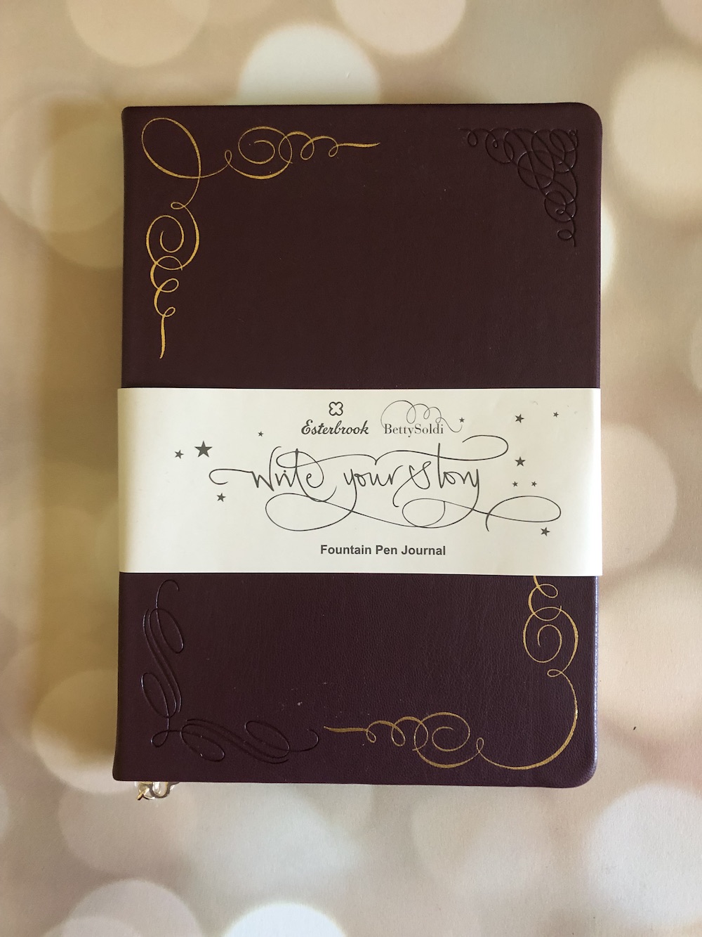
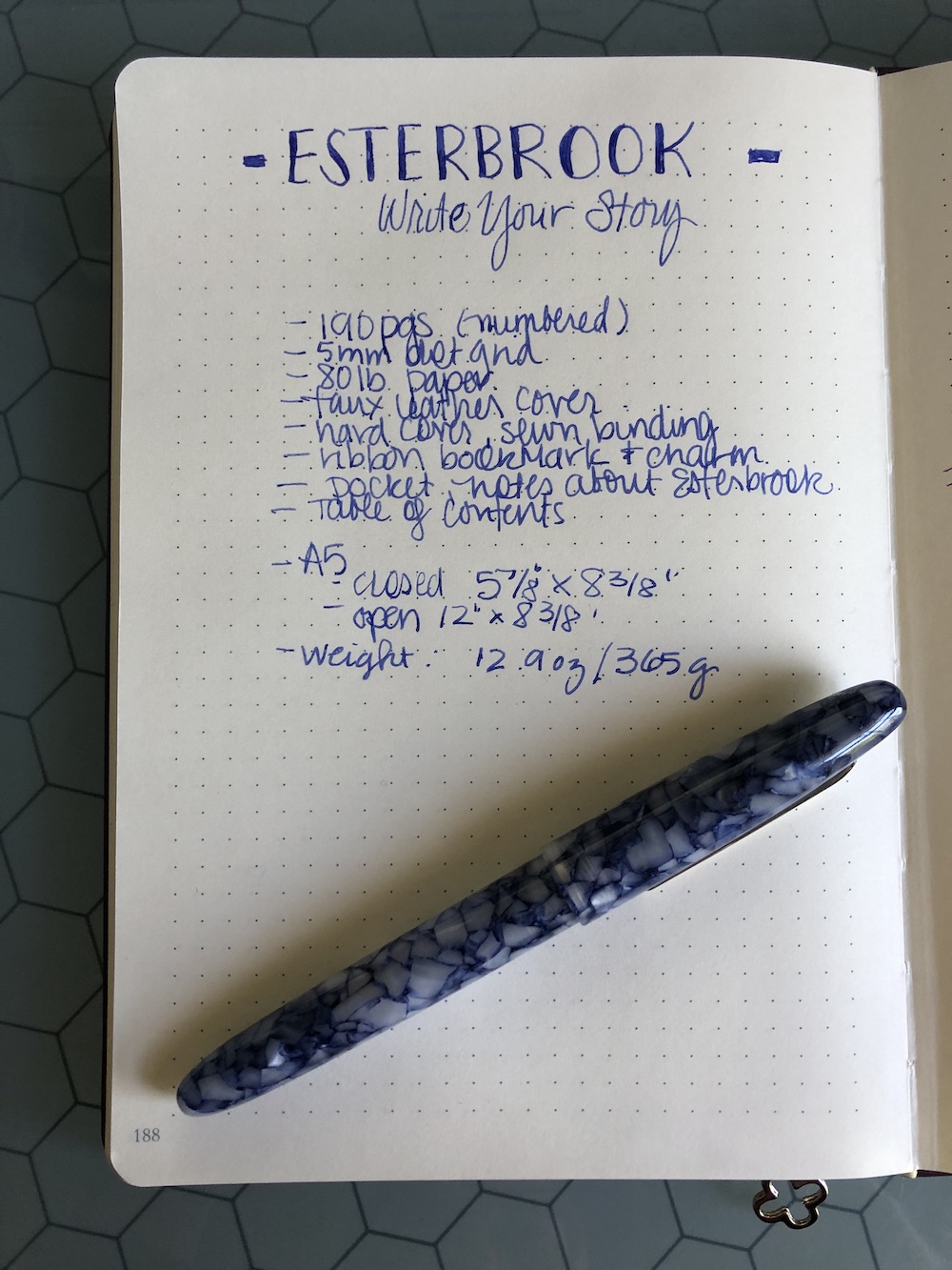
One of the presents that Ana brought me from the San Francisco Pen Show was one of the new Esterbrook “Write Your Story” Journals ($39.99 at Esterbrook). This looks like the perfect journal for me so I’m eager to dig in!
The Esterbrook “Write Your Story” journals are a collaboration between Esterbrook and lettering artist Betty Soldi. The A5 journal comes in three colors: burgundy, teal and camel. The cover has a faux leather feel and is adorned with foil and etched embossing in Betty’s “Alphabetty” font. The journal is hard cover, with a sewn binding.
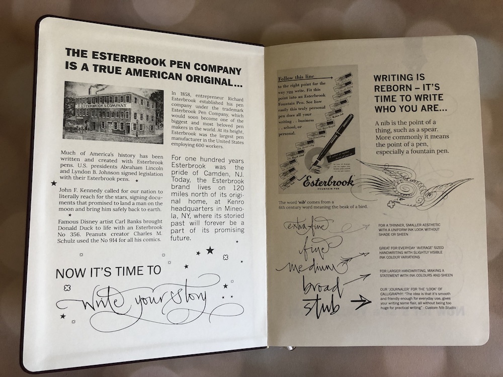
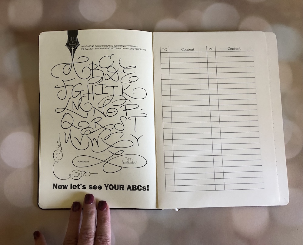
The inside of the journal is also fun! The first spread shares a bit of history about the Esterbook brand as well as a few facts and tips about writing with different nibs. The next page provides a place to trace the “Alphabetty” font if you wish, and encourages you to have fun with your own lettering. What follows are 2 pages set up for recording the contents of your journal.
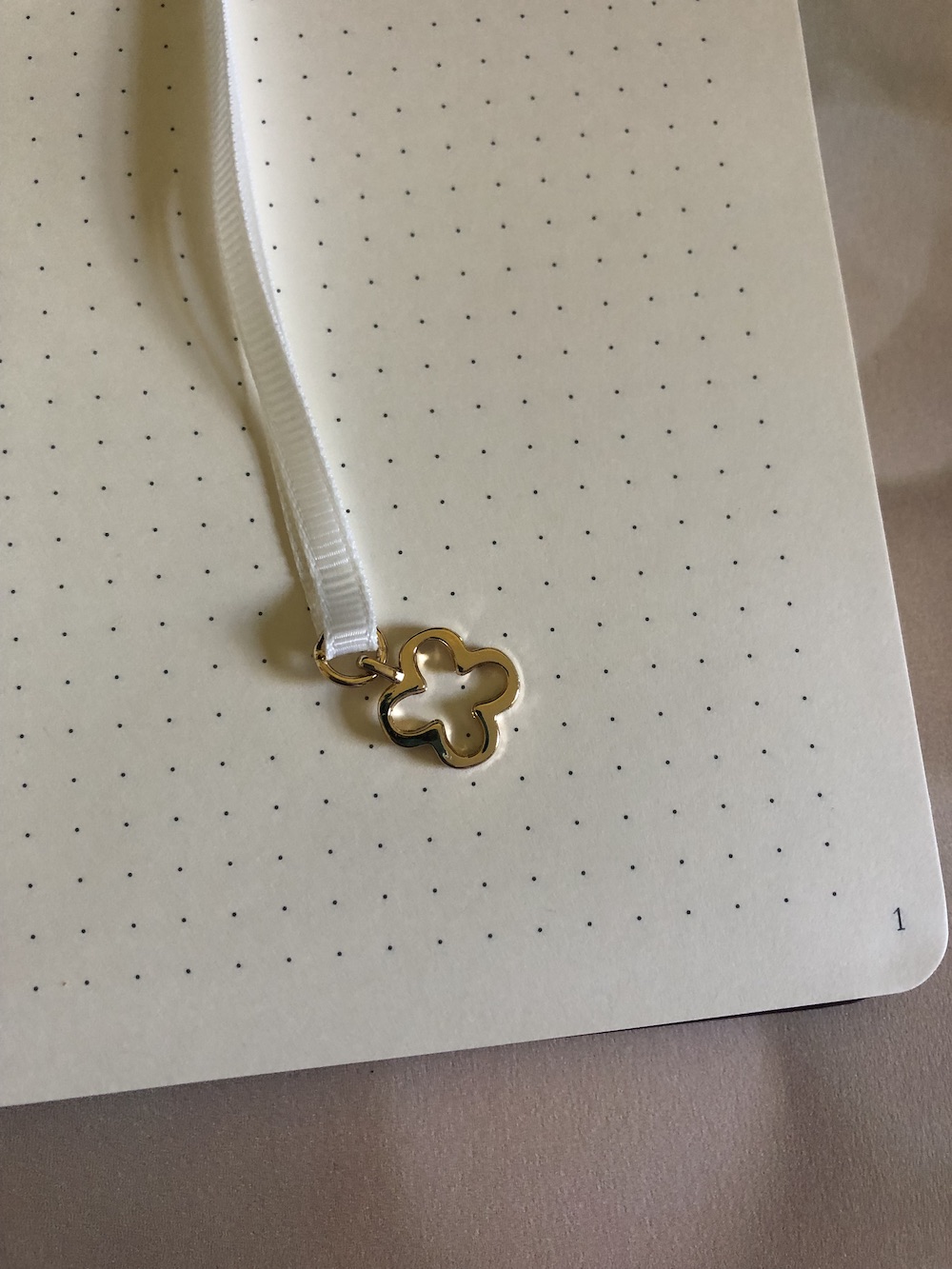
The bulk of the journal is made of up numbered pages (190) of 80 lb fountain pen friendly paper in a cream color with 5mm gray dot grid. To the touch it feels smooth and almost a little luxurious. The final details include an envelope at the back, and a ribbon bookmark with an Esterbrook charm.
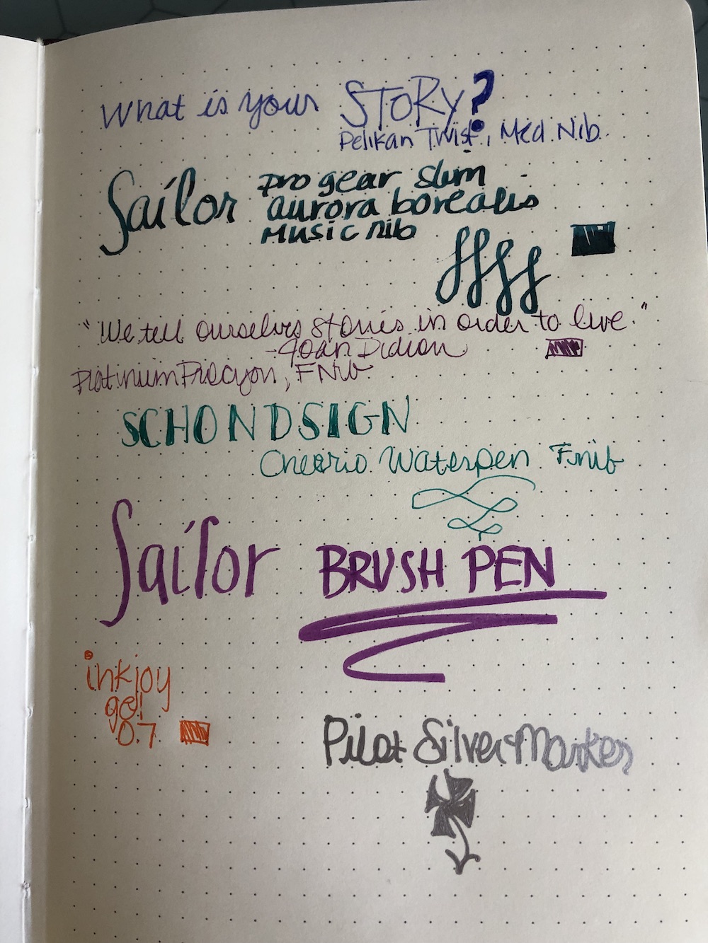
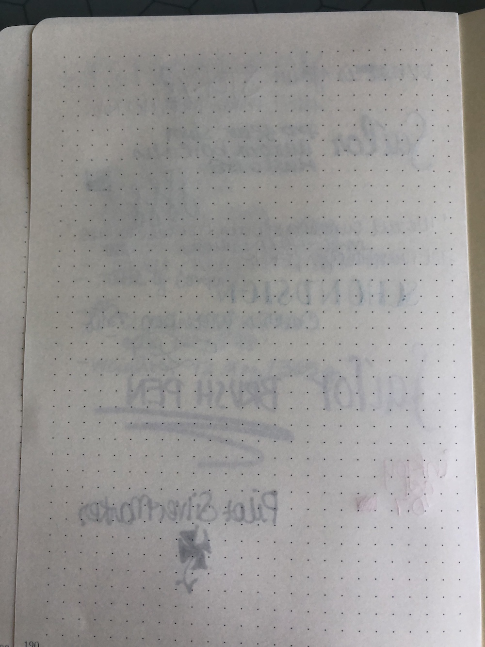
Now we get to delve into the paper! I found the paper enjoyable to write on. It was super smooth, and the ink dried fairly quickly. There was no feathering or bleeding, and on the plain writing sample (the first one below) there was very little show through.
I then tested wider nibs, different kinds of pens (brush, gel, etc) and even a silver writer which I believe is alcohol based. Even with those there was show through, but no other issues.
Ultimately my opinion on this notebook is that it’s pretty darn nice. I am definitely a tactile person, and just holding the cover and feeling the paper in my hands is a pleasure. It’s not an inexpensive investment and I surely wouldn’t use it for to do lists and the like, but if I’m thinking about keeping it as a journal and re-reading it over and over, then I would definitely consider buying another!
DISCLAIMER: Thanks to Esterbrook for providing this journal free of charge for the purpose of review. Please see the About page for more details.
Last minute correction, I didn’t match the comments to the email addresses for one winner. Luckily, she caught my mistake and everything is A-OK! Sorry for the confusion!
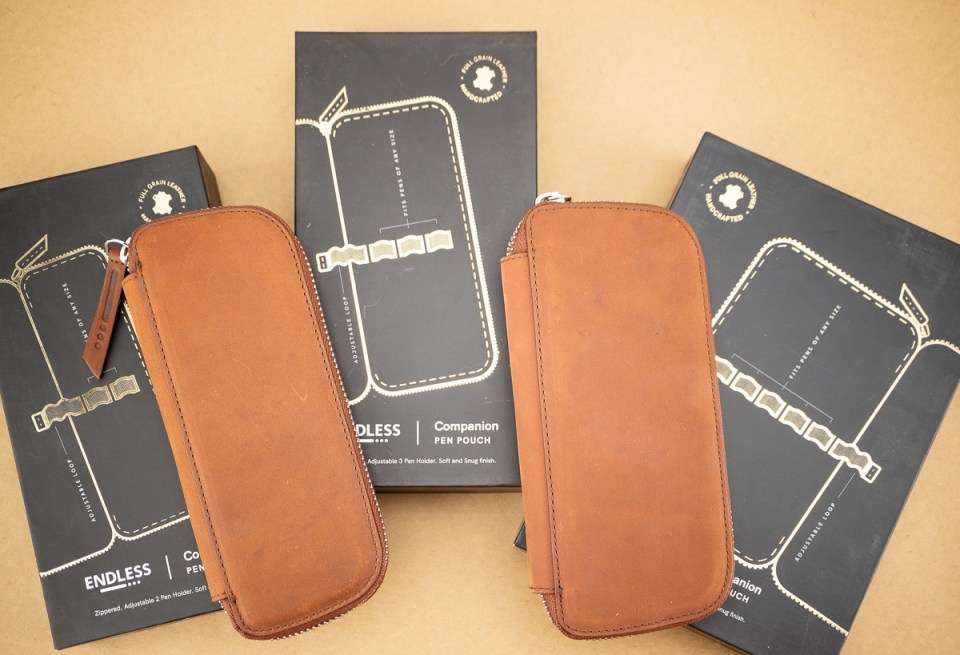
What are the odds that the random number generator would pick 3 winners all requesting different sized Endless Pen Companion cases on the first try?!?!? Today, the odds were 66%. So I had to toss a coin for who got the 5-pen and the 3-pen case. Pretty amazing!!!
So without further ado, drum roll for our winners:
Jen and Theresa, I had to toss a coin as to who would get the 3 and 5-pen sized. I hope the coin chose correctly!
And (correction!) the final winner was Lisa S. who chose the 2-Pen Companion:
Thanks again for everyone who entered and a big thanks to Luxury Brands USA for supplying the cases for our giveaway.
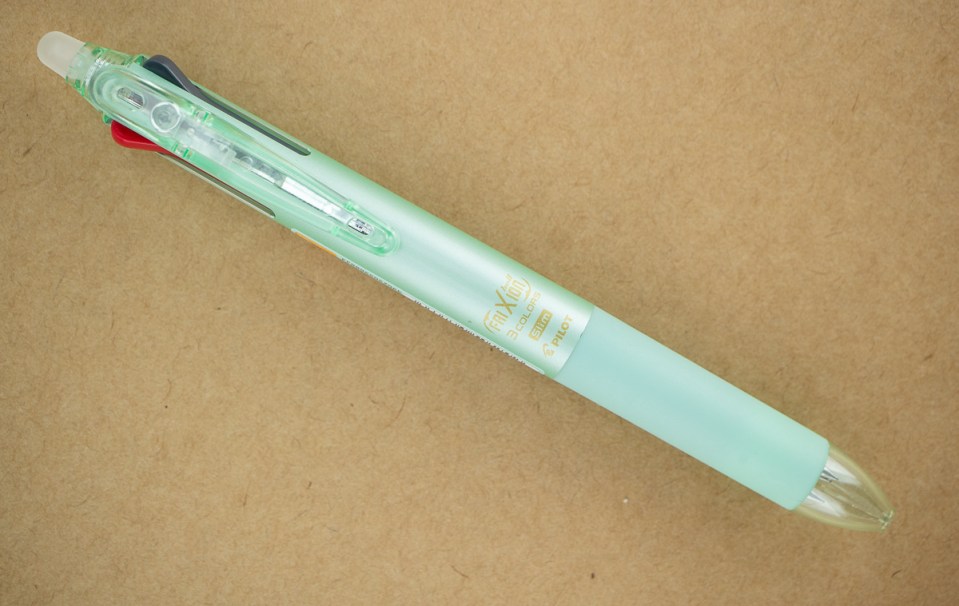
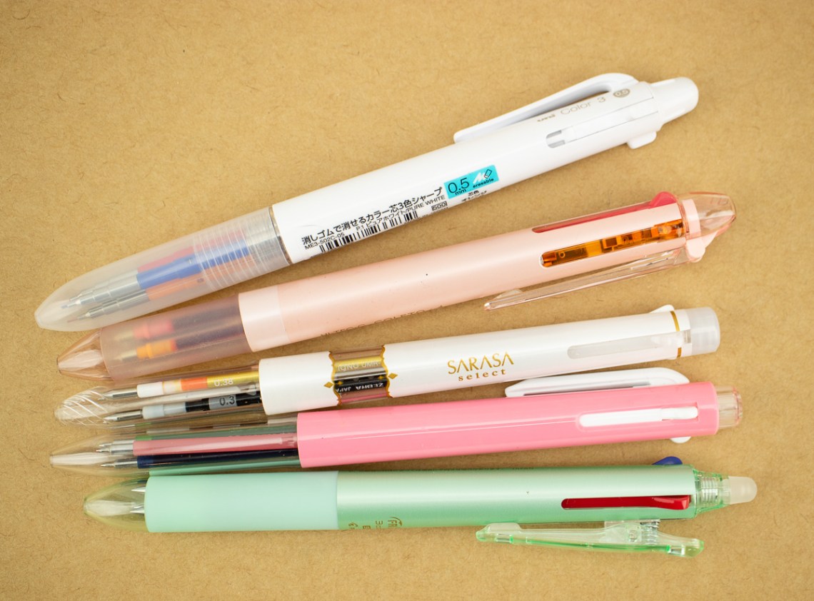
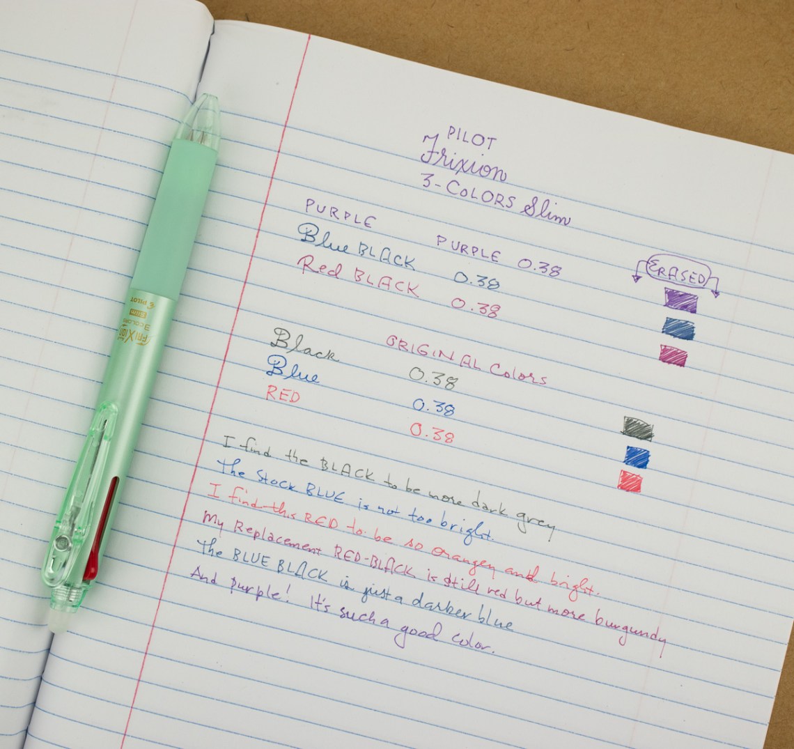
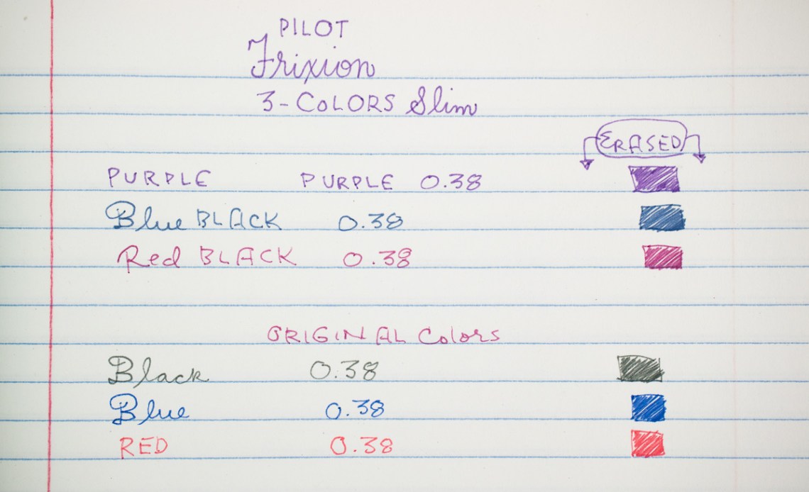
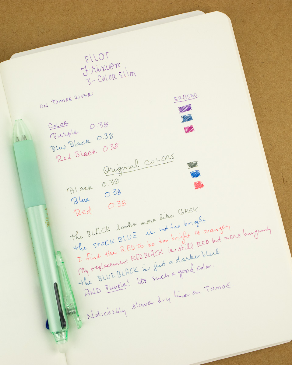
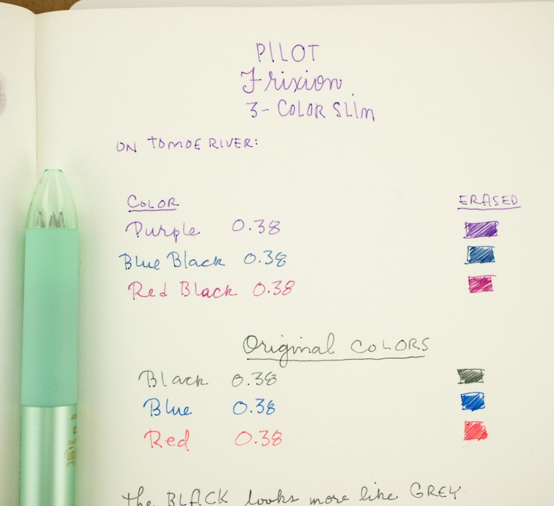
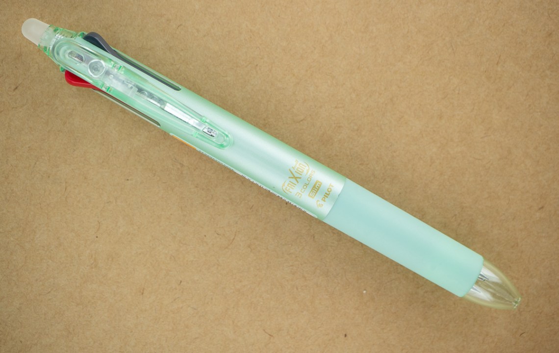
I have such a soft spot for multi-pens. I decided to try a dedicated Pilot Frixion 3-Colors Slim in pearl green ($9) with three different color options and came with 0.38 tip size (which is my favorite gel pen tip size).
The Frixion 3-Color Slim hanging out with all the other mult-pens I’ve accumulated. I think I have one from each of the Japanese brands: Zebra Sarasa, Pilot Coleto, Uni Pencil and Pentel Slicci. All from JetPens.
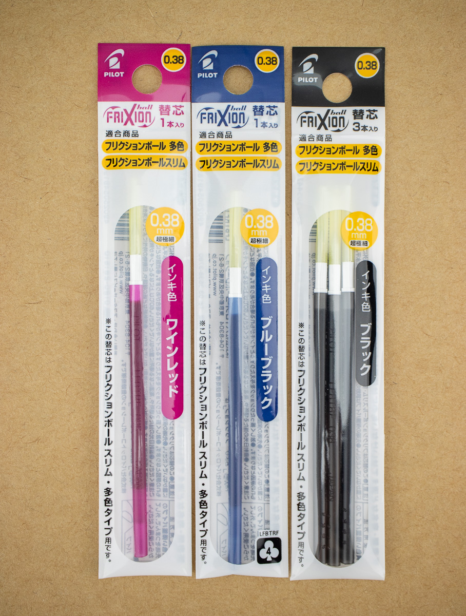
The Frixion 3-Colors Slim came with the standard red, blue and black erasable gel refills. Being spoiled by the endless variations in color in fountain pen ink, I get really pouty if I have to use “boring, standard” colors in any writing tool. So, I was delighted that many alternate color refills were available for the Frixion multi-pen (individual refills start at $2.30).
I tested the Frixion pen and inks on two paper types: a standard big box store composition notebook and my fancier Tomoe River as well.
I’m really happy with upgraded ink colors though it did make the multi-pen exponentially more expensive than using the stock inks. I did not find a Frixion multi-pen option that came empty though so if you are hoping to upgrade the ink colors in the Frixion multi-pen the final price will come in at about $15USD. While the refills might fit into a different multi-pen body, the “frixion”-specific multi-pen bodies are the only ones that include the built-in eraser. It is possible to get a stand alone Frixion eraser ($1.65) if you want to mix it up.
On the very porous composition book paper, the Frixion eraser erased adequately. It was a lot of ink converage and probably not the same as erasing a couple words of text so, depending on your paper YMMV.
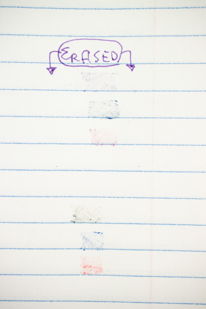
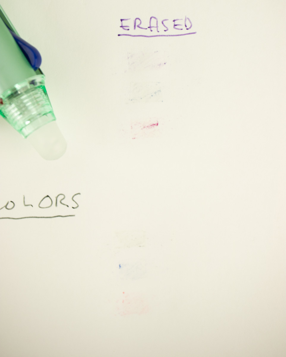
Next up is the Tomoe River paper. Overall, the Frixion multi-pen performed similar but there was a noticeably longer dry time for the ink on Tomoe River.
The color and line weights all looked similar on the TR paper and the ink erased quite easily. I would even say that it erased better and more completely than on the composition book.
Overall, the Frixion multi-pen is a lot of fun and the erasability is a really great feature that I always forget how delightful it is to be able to erase ink.
Other sizes and configurations are also available with 2- to 4-color components. See the full collection here.
DISCLAIMER: The items included in this review were provided free of charge by JetPens for the purpose of review. Please see the About page for more details.
 Julia van der Wyk is an artist, classical musician, knitter, and professional web developer (