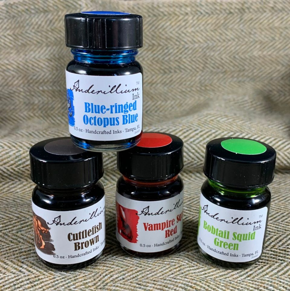
This week I am looking at the properties of Anderillium inks, starting with the first four from the Cepholapod series: Blue-ringed Octopus blue, Bobtail Squid green, Vampire Squid red, and Cuttlefish brown. If you would like to see all 16 ink colors, be sure to read my post from last week!

First, a comparison of colors. Blue-ringed Octopus blue is a bright cyan that sheens red occasionally. It reminds me of Pelikan Edelstein, but when I compared the two, Blue-ringed Octopus is noticeably darker.

Bobtail Squid green is a bit brighter than Robert Oster Jade, and not quite as yellow. I love the shading in this ink – the difference between the dark and light shades is dramatic.
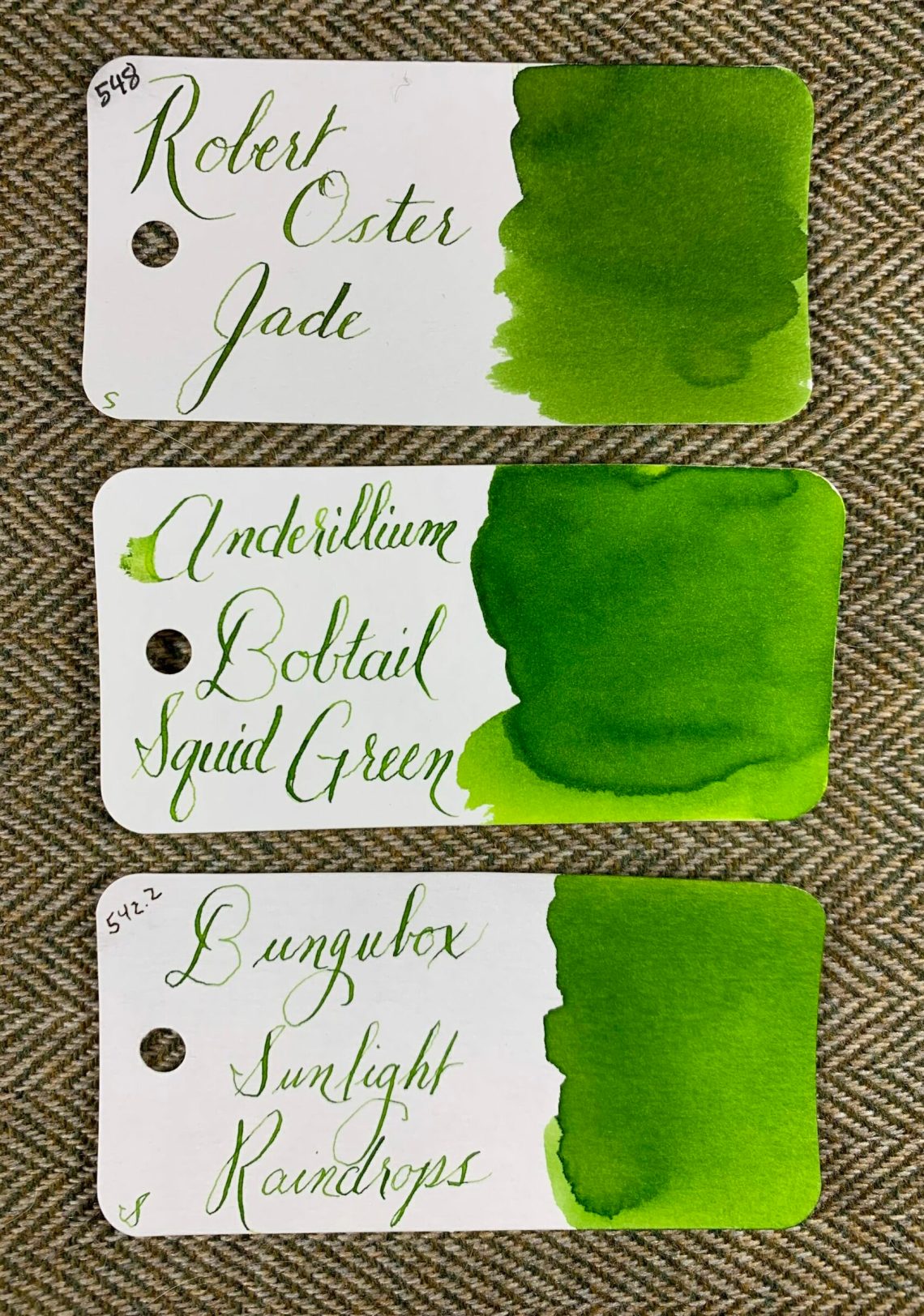
Vampire Squid red is a wonderful bright red that is dark enough to not hurt your eyes. You can see a touch of the gold sheen in the lower right corner of the swatch card below.

Cuttlefish brown is a very interesting ink – when used with a wet-writing pen or nib, it appears off-black. When Cuttlefish is used in a fine pen or a dry pen, it appears as a light, muddy brown with hints of yellow. Montblanc Wood & Tobacco is the closest color I have to Cuttlefish and even the Montblanc ink isn’t quite as dramatic.

Below are the four inks on wheat straw paper from my swatch booklet. There was no feathering and no show-through but also no sheen on this paper.


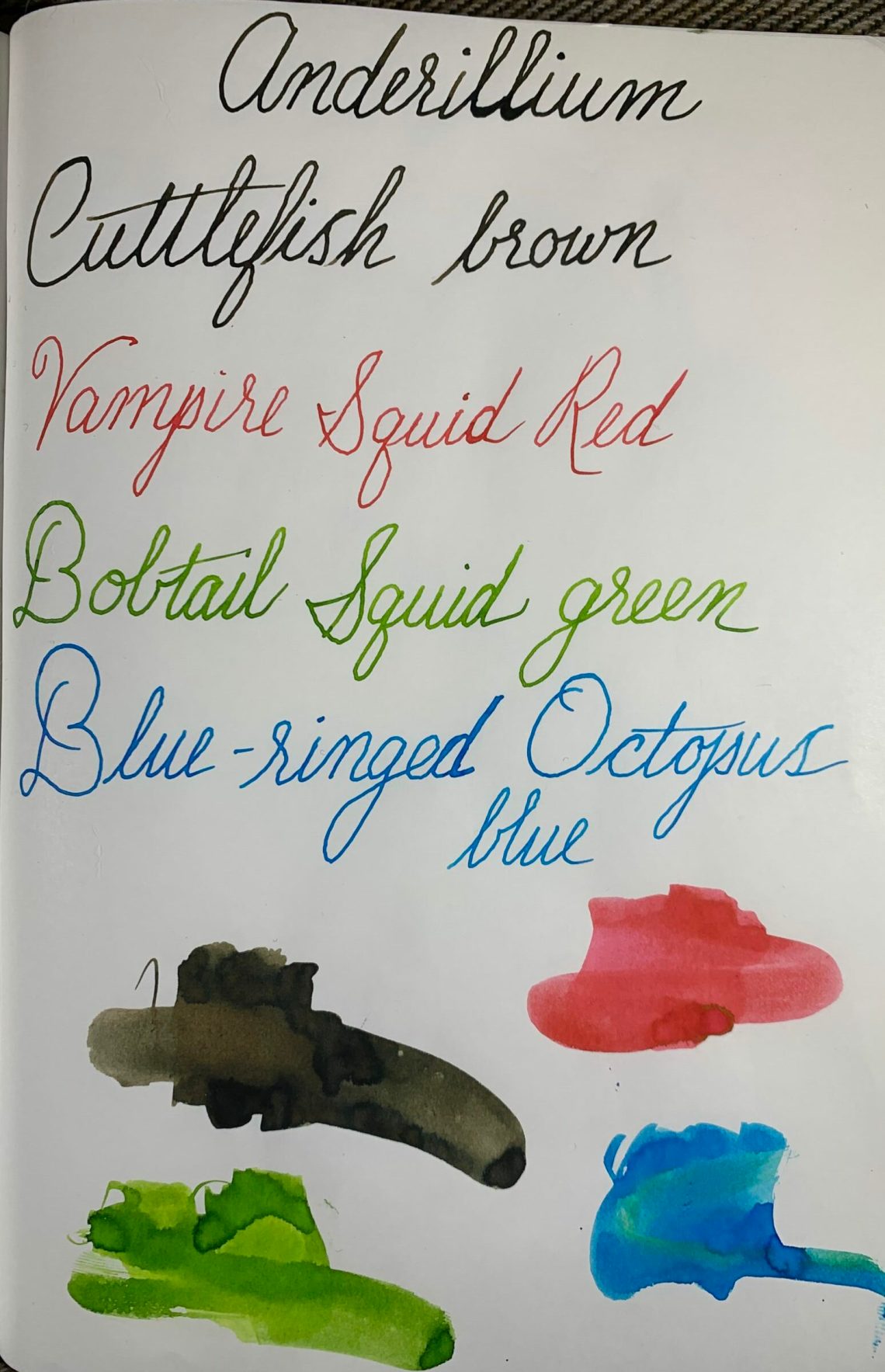
Below is Tomoe River paper. I’ve slightly smeared each ink below to show some of the properties of the ink although please note that the green in the Blue-ringed Octopus smear is from inky fingers, not from the ink itself. TR paper shows the Bobtail ink shading and a bit of the shading in Cuttlefish, but the nibs that I used for Blue-ringed Octopus and Vampire Squid were too narrow to show sheen. You can see a hint of sheen in both in the smeared ink at the bottom of the page, however.
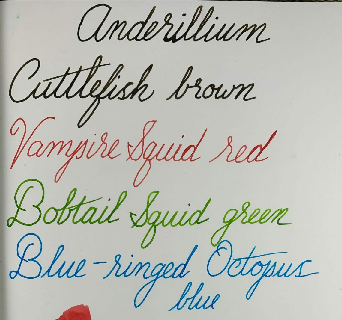
Shading is better on the Cosmo Air Light paper below, especially in Bobtail Squid. Cuttlefish showed no real shading here and I continued to not see sheen in Blue-ringed Octopus or Vampire Squid. The smear tests with the blue and red both showed the sheen, however.
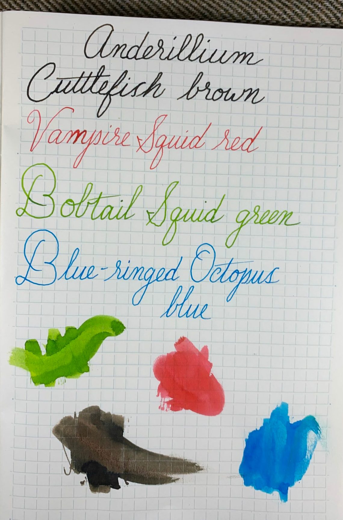
Midori MD paper light seems to have a flattening effect on each of the four inks although you can see more of the color variation in the Cuttlefish smear. I saw no sheen on this paper.
Out of the four types of paper I used in these tests (five if you count the Col-o-ring cards), there was no feathering, no bleed-through, and no smearing (except where I smeared on purpose!). Out of the four inks, Cuttlefish and Bobtail Squid are absolute favorites because of their unique colors. Blue-ringed Octopus is a beautiful cyan and I am going to try a wider nib for better sheen. Vampire Squid red is one I would probably pass on – the color is not quite saturated enough for my taste and was too dry.
All four inks I have shown in this post do feel slightly dry on paper but flow well through the pen. I didn’t experience hard starts or railroading, but the feel on the page was similar to writing on slightly toothy paper. I rather enjoyed the feel of the drier ink! I have several wet-writing pens that will be great to use with Anderillium inks to balance the flow.

Check back next week for more Anderillium ink testing!
DISCLAIMER: Some of the items included in this review were provided to us free of charge for the purpose of review. Please see the About page for more details.

I was captivated by the colors. I am eagerly awaiting the release of the smaller bottles.